Showing posts with label 2016. Show all posts

Friday, December 30, 2016

I can’t believe that December whizzed by without much thought to home decor  blogging.  The holiday season always puts things on hold. I have to make up for that with a good summary of what 2016 holds in design trends for the home.

 How do I know what to write about trends? A good question for sure. Knowledge comes from a lot of reading and looking and being a good synthesizer.

  A trend is never  for one year;  all I have to do is look back at what I wrote last year to realize that everything still holds true.  When I write about trends I  like to write about broader patterns I notice in  home decor  that I feel have some staying power.

There’s nothing earth shattering to report for 2016, but there’s usually not major shifts.

Plants  and plant motifs bring the outside in  

 Home decor trend plants plant motifs
Source 
You can also see the use of blue, wire furniture, and natural woods carried over from last year. 

Pastels are still creeping in usually mixed with soft whites

Pantone’s 2016 colour of the year duo supports this.  I’m not saying I love this look but I do like the softness of the colours., there’s just too much baggage attached to pink and blue.  Take either separately and I am fine, especially that periwinkle blue.  
Pantone 2016 colour of the year
pastels bedroom nude pink mint green
Source 
 Here we see the nude pink with mint green (hello 1980’s) and blue accents.   Notice the plant!

Adding texture using organic materials 

 It could be fur, woven textiles from natural fibres,  wicker,  rushes, or plant life.  All add that exciting layer of texture that every room needs for interest and excitement.

texture organic materials
Censationalgirl 

Hope you noticed the liberal use of greenery in this space too, and the white walls and furniture. White is the perfect backdrop for showing off textures. 

texture 2016 fur natural fabrics
source 

Warm metals in  accessories, fixtures and lighting 

I know I’ve been saying this for three years, but each year the presence of warm metals becomes more noticeable.  Also consider burnished brass, copper and rose gold.  

warm metals lighting art work

source 
This is a totally trendy room,  nude pink undertones, lots of texture, warm metals, natural fibres, plant life and light walls. And the opposite is also trendy….

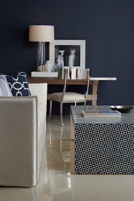
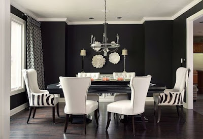
Dramatic walls and rooms

This is in direct opposition to the white/light look for walls and furniture.  But drama can be embraced.  It’s not for me at all, but it is a look that appeals to many people.  Navy walls are particularly fashionable as are black and rich greens.  
 navy walls dramatic rooms
dramatic rooms gold texture black walls
source 
black walls white dining room dramatic rooms
source
These are trends from 2013 -2015 that are still going strong:
  • geometric patterning 
  • nature inspired motifs especially florals 
  • reclaimed/eco-friendly material
  • wire framed furniture and lighting 
  • use of mixed materials in furniture  ( marble and wood, metal and wood etc. ) 
  • global inclusiveness  ( products from different cultures)
  • highly patterned tile
  • artisan products ( hand made) 
  • nude pink and deeper blues.  
And there you have it.  Lots of things to consider and choose from or just go on your merry way doing what makes you happy in decor.  

The post 2016 Home decor trend checklist appeared first on Decor Pur.

Thursday, December 15, 2016

When does a trend become overused and tired?

Sometimes certain trends are grabbed by many homeowners,  and before you know it they are everywhere and you may begin to feel like you have reached your viewing saturation point.  I get this feeling a lot on Pinterest. It might be a pattern, a wall treatment or specific fabrics.  I find myself thinking… please no more.

Does it really matter to the average homeowner?

Only you can answer that question. I’m not censoring  what a homeowner chooses to use to decorate a home. Rather I am  just commenting that certain  design decisions seem to be very overused, and as a result  if you want to have a home that is a little unique or individual, these design decisions are probably not the way to go.

Chevrons

chevrons, bedding

I have always been a lover of geometric prints.  There was a time when I loved chevron designs, but that affair has ended!  Too bad I have to say good-bye;  perhaps in ten years we will have a reunion.

Animal prints

animal prints
source 

I have to work hard to warm up to animal prints, but  I agree that their  organic spots and stripes are very interesting when you want to include  patterns in a room.  Maybe one or two  animal prints might be good, but more than that becomes overdone.  I like to  introduce them using small items like a  box or a pillow because they are easier to replace when you get tired of them.

Blackboard walls

blackboard wall, kitchen
source 

Having been a teacher, I left blackboard walls behind years ago.   I think they work well in  a child’s playroom or bedroom because they serve  a functional purpose, but they are dusty. Think about allergies too.  There is something messy and not quite right about them in main rooms of a  home.

Gallery/salon  walls

gallery wall photos
source

I love  smaller gallery walls that are very organized.  Too many items and you end up looking at the organization (or lack thereof)  and not the individual  pieces of art.

Baskets everywhere

bathroom shelving, baskets

I have  baskets in my home here and there because they are functional, but I am always careful  not to overdo it.  I don’t want someone to walk in and think … the house of baskets.

 Text as art

text art walls

  Yes, I like quotes, I even collect them and I love text.  Their use as art  just seems to be way overdone in the last few years.

Faux taxidermy

faux taxidermy, white deer heads, vignette
source

 Here’s another design  motif  that when  used in the right setting  added an individual note to a space in the past, but not anymore because faux taxidermy is  everywhere and I am still trying to figure out why.  Are you a lover?

Starbursts

dining room starbursts
source

Another beautiful motif that has reached the boredom point from overuse.  As a lover of circles and rays I would have to think  long and hard before using a starburst in a design right now.  Too predictable!  Another element on my revisit after 5 years list.

Large horizontal stripes

black and white stripes
source 

When this image first popped up on Pinterest I was attracted to the strong graphic nature of the stripes.   Very quickly bold, equally sized and spaced stripes were popping up everywhere especially black and white ones.  Nothing was sacred as they appeared  on walls, rugs, pillows, tables etc.

And how about you?  Do you have design elements or objects that you think need a rest?  Perhaps you love some of my “tired” choices and want to argue for their continued use.

The post Do these decor trends need a rest in 2016? appeared first on Decor Pur.