Showing posts with label drapery. Show all posts

Thursday, December 29, 2016

Ah, the dreaded question.  What colour draperies should I have?

Part of being a decorator is making informed decisions about design.  Keeping current with trends  through reading and viewing is a must, but trend knowledge is not enough.  You have to understand what affect your choices will have on a space.

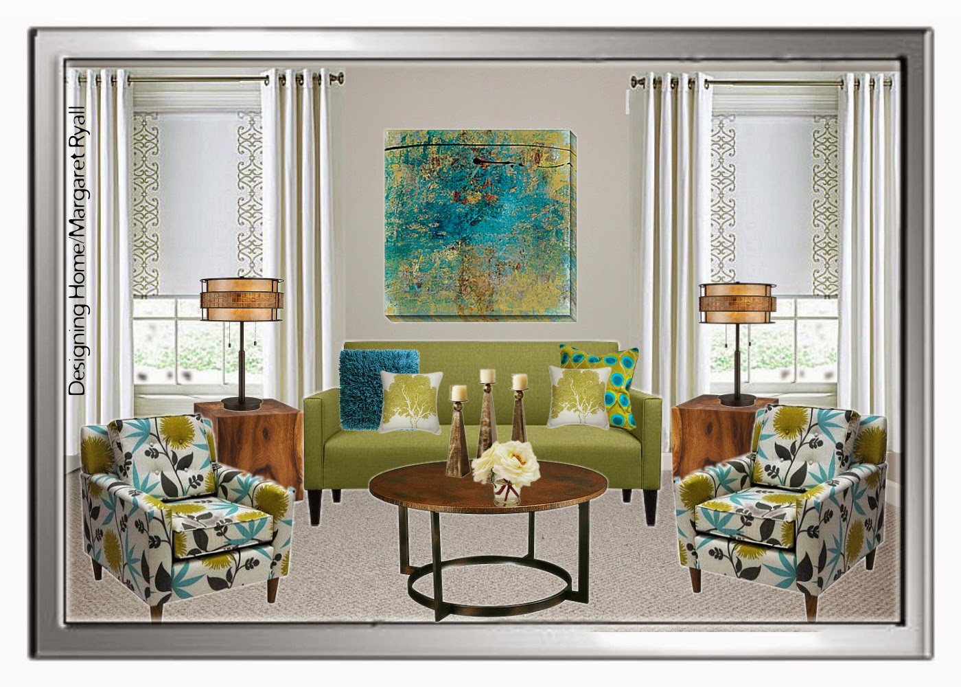
I posted this picture on Designing Home Facebook Page as an example of a style board I create for clients.  I am not one for vivid colour, but I didn’t have to live with the colour, a young lady who loves rich colours did.   Should I have argued with her and said you shouldn’t have bright draperies. NO!  I have to balance my client’s likes with the principles and elements of design.

vibrant drapes, turquoise drapes, vibrant living room, Designing Home
Vibrant  draperies 

Let’s look at what this colour choice  did for this room.

 You can’t ignore this window treatment, it’s not only the vibrant colour, it’s the placement and amount of it. That means a lot of colour jumping forward in the space. The draperies also serve to  frame the artwork and the sofa. The more muted sofa is anchored and held captive, and you need an equally vibrant art work to compete with the windows. When you look at this space blue is primary and everything else is secondary.

The overall effect is focused and the room appears smaller than it actually is.  That’s a great tip if you have a large space that you want to appear smaller/cosier.  Go for darker/brighter  window treatments that draw the eye.

 I see this as a lively, energetic scheme that is equally matched to a sparkling, vivacious young lady.

On to number two example….

soft white drapes, roman shade, fresh living room scheme, Designing Home
I removed the vibrant draperies and choose something more in line with my personal taste.  I like my spaces to be expansive, and tone -on tone- window treatments  (keeping the colour of the drapes and the walls very similar) is  one way to achieve that look/feel especially in a smaller space.  
Now the sofa and artwork stand out as they didn’t before.  Your eye connects the light colour in the chairs with the draperies and you visually wander the space. 
On to example number three….  
fresh living room scheme, fresh green, turquoise
Same window treatments, but I’m tweeking a few other things. Without the blue pillows on the chairs,  and the blue vase on the table, the space is even even more opened up.  The overall effect is fresh and inviting,  reminiscent of a summer garden – always a look I gravitate to.  The wooden tables help that feel too. 
So there is no right answer to the question “What colour draperies  should I have?”  It all depends on how you want your room to look/feel. 
If you wan to find out more about current trends in window treatments check out this post and several others in my side bar. 
What’s your preference when buying  window treatments ?  Are you a neutral or a colour lover?

The post Choosing a drapery colour appeared first on Decor Pur.

Tuesday, December 27, 2016

The devil is in the details and simple decisions can lead to big
impact both good and bad.  Since there aren’t any  absolutes in
decorating, things often  come down to personal preferences.  One of the
the things I’m fussy about is what colour rods to use to hang drapes.

There’s lots to choose from.

Metal hardware is available in a variety of finishes : wrought iron,  aluminum, chrome, brass, and oil rubbed
bronze. Wood hardware is available in almost
any finish, from natural blond to dark espresso.

types of drapery rods
Styles of drapery hardware

 There’s two ways you can go when choosing a colour for your rod. Choose a color that matches:

  •  other items in the room
  •   the colour of the drapery   

  When you choose to match  other items in the room it is often a good idea, but it doesn’t always work as you can see in the photos below.

black drapery rods bedroom
 Pinterest

It is obvious that the rod colour decision was based on matching to the dark woods in the room, but why would you want to break the lofty look that is going on here with horizontal dark lines?  When I look at this room, my eye automatically goes to the ceiling.  Contrast always draws the eye.  You probably don’t want a focal point near the ceiling! 

black drapery rods printed drapes living room

This rod is also dark, but the same thing isn’t happening because the drapes are highly coloured and patterned.  I still would not use black.  In fact I probably would rarely use black because it is too harsh unless you have black drapes or it is a very modern decor. In this room I would look for something lighter that blended with the wooden blind too and make the whole thing more of a unit.

This is a good neutral colour when you have golden tones in a room. 
You also have to watch where you use wooden blinds. The combination below really works.   

bamboo roll up bamboo drapery rod  
 Pinterest

 This is a very cohesive look.  When you add wood blinds you automatically introduce a more casual element to the space and usually the colour is lighter. Choose your rod accordingly.

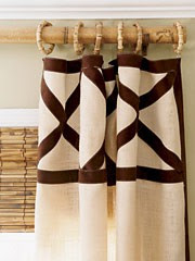
back pleated drapes light gold rod
  Pinterest

 This rod has enough colour to be noticed and it allows the drapes to have center stage. Imagine what a different room it would be if the rod  were black.

black drapery rod with banded drapes
 Pinterest
How do you feel about this rod choice with these drapes?  Certainly  the black isn’t as harsh as in some of the other examples, but it does compete a little too much with the horizontal banding for my taste. Personally I would choose something more neutral  to  match the top of the drapes.
light drapery rod cohesive look
Pinterest 
A pulled together look. 

What are your thoughts on choosing an appropriate drapery rod for your space. Do  you have an aversion to black rods in light spaces?

The post How to choose drapery hardware appeared first on Decor Pur.