Showing posts with label Thoughts. Show all posts

Thursday, December 15, 2016

So you have an armoire and you are eying that space between the top of it and the ceiling.  Do you or don’t you put anything on top of it?   You might want to consider the following:

How much space do you have to work with?
If you have less than 24 inches  I suggest forgetting about adding something above it. Here’s why:

armoire

This is a lovely  armoire, but the flowers are squished in, and they would be so much 
prettier in a different spot. The arrangement looks awkward.  The scale of the flowers and pan are perfect if only the armoire were a little shorter. If you choose to put something smaller in scale on top it would be difficult to see and you would have to stand back quite a bit to see it. 

BUT sometimes you can make it work.  There’s always an exception to every  rule.

armoire
 Bosworth Hoedemaker

Even though these baskets touch the ceiling in places, their colour, scale and random/exciting arrangement  make them appear as if they are an extension of the armoire. The armoire is also at the end of a hall and will always be viewed from a distance allowing  you to see what’s on top of it.

armoire
source

And you can usually get away with one large low object with a tall armoire

armoire

Hingham Kitchen & Bath Designers 


especially when the object is the same colour as the armoire. 

Do you want your eye to go to the top of the armoire?
If your armoire is a centre of interest in your space you may want to add other elements to enhance that position and make it even more commanding.   You might also want to add something if you have other tall elements in the space or you want to create some height variations among the various verticals in the space.

If you have enough space and you want to draw attention to the armoire here are some tips to consider:

Think in odd numbers. 

armoire
source 

If the armoire has glass doors, consider using the same type of objects stored within it on the top.

armoire
source 

This arrangement of bottles and bedding is a natural addition to what is already stored inside the armoire.  The light colours make the whole unit look very cohesive.

armoire
source

  In this child’s room the top of the armoire seems to be the perfect place to store these large toys.  Because they are the same colour as the room and the armoire, they don’t seem too big.  That leads me to the next tip:

If you don’t want to draw too much attention to the objects, but you want to fill in the space consider using objects that are the same or similar colour of the armoire or the wall or use clear glass. 


armoire
source


armoire
source 


armoire
source


If you are going to add a piece of art that high make sure it is a bold image that it can be read from a distance and lean it against the wall , if you are considering using a photograph the same guidelines apply.

armoire
armoire
Think about groupings of the same object in different sizes. e.g., vases, glass bottles, boxes, baskets, birdcages, wire sculptures, spheres,  ginger jars, etc.
If you scroll back through the photos in this post you will see this tip used in a number of ways.

How about you?  Do you have any thoughts on decorating the top of an armoire? 

The post Thoughts on decorating the top of an armoire appeared first on Decor Pur.

Tuesday, December 13, 2016

 Questions  about the wisdom of  choosing dark  kitchen cabinets keep cropping up in my reading and client discussions. Of course there are no absolutes in decorating.  You can make anything work or look good if you have the skills, and using dark cabinets in any room  requires a deft hand.

If you want your dark cabinet choice to work and have the longest style staying power, consider the following:

Let the cabinets shine

dark cabinets high contrast
  source

 When I work with clients who want everything that they consider trendy
in one space, I always discuss the wisdom of this approach.   Something has to be the star in a space and you should decide in the beginning what the star will be.  When you choose dark
cabinets they demand centre stage, and everything else should support them
and make them look their best.  Using lots of white or very light
colours with dark cabinets is the way to go to get that sophisticated,
rich, classy look that many people are after when they choose dark cabinets.  

Use  in open area spaces

dark cabinets open concept
  source 

Dark cabinets work well in large, open area spaces where the wall colours are lighter rather than darker. The dark cabinets help to balance and ground the space. .

Have breaks in the dark flow

open spaces with dark kitchen cabinets

 source

 Leaving lots of wall space free of cabinets and/or having glass with light interior cabinets can do a  lot to balance a darker cabinet colour.  Having contrast with the floor is a must to create a lively space.

Mix dark and light together

mixing light and dark kitchen cabinets

Braam’s Custom Cabinets

 If you are afraid of too much dark but like the look why not do a mix of darks and lights together? 

Questions to consider: 

 Is there enough contrast with the floor? 

dark kitchen cabinets dark floors
source 

When you choose dark cabinets your floors need to contrast with the cabinets or you are going to have the “bear cave” look that happens when your floors blend in with your cabinets. This is not an attractive look for  smaller spaces.    Even thought the floor above does have some contrast with the cabinets, I would have chosen something a tad lighter to open up the space.  Again, no absolutes, only considerations and photos often lie.  This is a lovely space.

 Is there enough contrast between elements?

dark kitchen cabinets contrast
source

This space is unusually dark.  It is the perfect kitchen for someone, but I would venture to say that it would not be a selling point for many buyers.

Can you have too much  pattern?

patterned countertop and backsplash
source 

  When you have darker, busy countertops  and then have patterned backsplash you are setting up pattern competition, and it can look very busy in a small space. My rule of thumb is patterned counter, plain backsplash.

Do you have enough lighting?
adequate kitchen lighting dark cabinets

 LDa Architecture & Interiors
Sometimes it is difficult to tell from a photo exactly how much light is in a space.  This space is reading dark even with the obviously adequate lighting from three (probably four with under counter) light sources and light reflection from the white counter and backsplash.

Who knew there was so much to consider when you decide to go for dark!  Again, there are no absolutes only considerations and balances.   Happy decision making.

The post Thoughts on choosing dark kitchen cabinets appeared first on Decor Pur.

Sunday, December 11, 2016

Now you may be surprised  to discover that some people  (especially decorators) put a lot of thought into turning a coffee table into a work of art!

  source
 source

   I frequently admire the sometimes over the top arrangements (vignettes or tablescapes to decorators) found in many decorating magazines and online portfolios, but they rarely seem practical to me.  First and foremost, a coffee table is a functional item that provides a place to lay  drinks, nibbles etc., but  I do agree that it is a flat expansive surface that calls out for some adornment.   How far you want to go with this adornment is up to you. 

Thoughts on decorating coffee tables Designing Home
Margaret Ryall
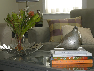
This is the most I have ever had on a coffee table and there was still lots of room for drinks and cheese. My ceramic  bird finds various homes around the house. You never know where he  might pop up.  Books are always great props if you don’t go overboard. They provide  height, colour and text as design elements.  
Everyone should have one great bowl .  Mine is from IKEA and it can always be found on my coffee table. Sometimes it has a vase of flowers added, 
 
 or Christmas ornaments  or gourds,  … you get the idea.  So a great looking bowl of some sort is a very practical solution that you can keep changing.  I like silver  and low because everything looks great with it. 
Here are some other great bowls….
source
Ceramic vases especially white ones are also great additions for every decor.  I particularly like small ginger jars or fret work jars. 
source
Mixing metals is very in right now and having a gold or copper bowl really warms up a space.  When you have a large coffee table you need an equally large bowl to keep the scale working. This is a very  “masculine” look.  Consider small globes, gears, wooden sculpture, carved boxes, magnifying glass, etc. for masculine additions.
source
 The ultimate bowl coffee table combination 🙂 from Phillips Collection.
Next….
Margaret Ryall 
is the versatile tray.   When you arrange objects in a tray and you want more space you simply lift it off the table.  This is a very simple fall arrangement on my coffee table/bench in  my family room.  Note Mr. Bird has moved rooms. The paper bag ceramic vase in grayish white is another of my staples.  It gets filled with all kinds of things from twigs to candles.
 source 

Three candle holders of varying heights are very versatile for  your decorating needs. You can change the colour of the candles for seasonal events. Natural elements like coral and flowers always add texture and a little of the outside world.  Think about starfish, shells, ferns, twigs, grasses, etc.as natural complements to glass and ceramic. Heights and textures add interest and move the eye around.

source 

Very simple and effective selection of objects in white and black. I like the fact the tray is wood which instantly warms up the collection.  A sphere of some sort is also a versatile object to own.  One with texture is even better.

And don’t forget plants…
source 
…with a little sculpture thrown in.  I have been looking for something sculptural to add to my small collection, but nothing has appeared yet.
Hope you found some ideas for your space…..

The post Thoughts on decorating coffee tables appeared first on Decor Pur.

Friday, December 9, 2016

Do you constantly change up your accessories seasonally, or do you stick to basics collected over time and add a few seasonal  things to spice  up your space?  Perhaps you are a minimalist and don’t think seasonal accessories are an important part of a space or you dislike “clutter”.  Obviously all types of homes and interests exist, and there is no right way to decorate your home, there are only personal tastes.

source

Maximum accessorizing

 I read a variety of blogs and am constantly amazed by the number of people who go “whole hog” for the seasons and holidays.  They are constantly changing it up, creating mantles and table displays for every special event.  The continual “hunt and gather” shopping and creating  that these looks require tire me out just thinking about it.  I could never manage it with my schedule (or pocketbook).  I always wonder where all these objects are stored in someone’s home.   Perhaps we  become too practical with age.  When  talking to friends we all seem to have the same ideas about  retiring objects not acquiring them.  I am wondering if maximum decorating is age related!


Minimal accessorizing

Then there’s the other side of the coin,  minimalist advocates  who are simplifying their lives as much as possible and that means eliminating “stuff”  and embracing function and clean lined beauty. That doesn’t mean they ignore the holidays;  they will often add subtle, simple and often natural seasonal touches.  I  understand this desire to have a quiet, unadorned space.

My personal taste

 I am a middle of the road kind of gal  when it comes  to the final layers in decorating.  I create variety by moving around my favourite things; you never know what will be where.  I also like to live with things that mean something to me, with  that meaning coming from various associations.  However, I do give a nod to holidays and seasons by adding in a few special touches to celebrate.

Quilt block by Sharon Griffin

As an artist, I am interested in objects that are original, hand crafted, and have beautiful shapes.   My current love is this quilt block (it takes the idea of a quilt block to another level) created by a friend of mine.  You can see how she makes her own home unique here. The gerber daisies are my nod to fall, and the colours in the quilt block will work year around with reds and purples prominent.  So one container, one piece of art and lots of options.

Kubus 4 Candle holder

Many of the iconic designs of  the mid century modern period continue to resonate with me and over time I am adding my favourites to my decor. I love my Kubus 4 with its square, open base that allows you to place small objects within its frame.  You can also change candle colours if you are so inclined.

Then there are subject matter preferences or design elements that catch my attention – perhaps too much at times. Leaves, twigs, birds, squares and circles/spheres are favourite motifs that keep appearing in various ways throughout my home.

Circle motifs

You can go too far when you love something! The stylized sea urchins sculptures – a Target special- relate well to the black spotted bowl.   They remind me of my lazy summer days beachcombing,  and in the midst of winter, I need all the positive reminders of better times I can get.

I went back three times before I purchased this bowl at Bowrings – a local store. When I realized the circles are transparent I knew it was a keeper.  If you add coloured tissue paper inside it you have a quick change seasonal object.  Multipurpose is the name of the game when you want simple seasonal decor.

Can you see my interest in nature creeping into my space in different ways?

Plants and twigs and a nestled bird
Bird bowl by Erin McArthur

Flowers are always a part of  my decor no matter where I am.   Sometimes I make  arrangements from my gardens,  sometimes they are purchased, and sometimes a good fake is thrown in to mix it up a bit.  Another bird in hiding.

Every home needs a lucky bamboo 

Hello squares.  Repetition in shape is a powerful design principle that can lead your eye around a space and provide interest.   And no style is more beautiful than cleaned lined mid century modern, especially when the chairs are free and you just need to recover them.  There are lots of mixed wood tones in my home too, but they never get darker than this  walnut table. I’m still embracing my golden oak – a great backdrop for plants.

A fragile nest in a nature inspired vignette  
You may see a bird’s nest propped on a window ledge looking very out of place in a contemporary space, but very in place with my interests.  Thanks Anita Sing for the sea urchin and print!

 Your likes are usually repeated multiple times though out your home, many homeowners are quite surprised when I comment on this during an initial consultation.

Fall leading to Halloween

I guess it is safe to say I celebrate  seasonal changes all year long by including nature references in various ways. Now isn’t that an easy way out!

What’s you take on seasonal decorating?  Where does your style fit on the continuum?

The post Thoughts on seasonal accessorizing appeared first on Decor Pur.