Showing posts with label design. Show all posts

Friday, December 30, 2016

Modern style is a clean, streamlined furniture and architecture
style that first appeared in the  1930s with roots in the German Bauhaus School of Design
and Scandinavian modern design.   The modern movement was a response to what happened in design and history up to that point.  Art, architecture and  interior design broke
from traditional detailing and styles and forged a new path. Modern design is still a prominent style in today’s homes where homeowners seek original mid century modern furniture and accessories or resort to reproduction pieces.

  Defining characteristics of  modern interior design include:

 John Maniscalco Architecture
  •  simple, minimal, flat surfaces and unbroken lines 
  • low profile furniture with raised legs for an airy look 
  • wood floors but sometimes, cork, cement or rubber
  • minimal accessories

  • emphasis on form, geometric shapes
  • large windows that let the outside in
  • natural elements for accessories (large plants, sculptural twigs)
 
Kimball Starr Interior Design
  • use of metals, leather and glass
    •  molded plywood, clear and white plastics for furniture

     
    •  simple or no hardware

    George Nijland
    •  predominately light walls, especially white
    • controlled use of pure colours in furniture/accessories ( mostly red, yellow, blue) 
    • use of texture 
    • use of art to add colour,  design elements and a focal point

      use of geometric patterning


    Many of the iconic furniture pieces of mid century design are still reproduced today and this confuses people because modern  is not that new! What some consider leading edge has been popular since the middle of the century.


     One of the strongest trends in home decor  today is to mix  modern pieces with contemporary decor.   The overall tone of this room is mid century  modern , but the severity of line and the more minimal approach has been softened with accessories.  Removing flowers, books, vases and pillows would create a truly modern decor.

     In my own home I like to mix mid century modern  pieces like the dresser, bed and chair with softer accents and a range of patterns and textures.

    The post The dish on modern design appeared first on Decor Pur.

    Wednesday, December 28, 2016

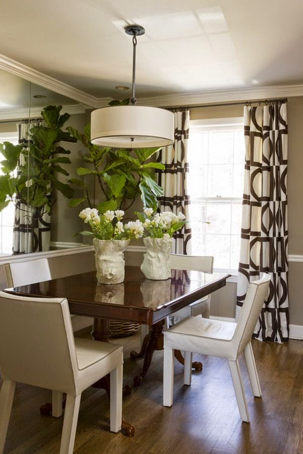
    Large can have a lot of meanings, but in Newfoundland large often  mean great or good or the best as in ” it’s a large day”.   Given that understanding here’s  a “large” dining room and a closer look at why it merits that rating.

    small dining room, design lesson, tips
    Liz Levin Interiors 

    This room has a lot packed into a very small space.    Just imagine this space with a matched dining set.  It would blend into the floor and be totally blah.  How did the designer achieve this look? Perhaps there’s something in her kit of tricks that you could use.


    Upholstered chairs

      If you have a dining table you love, and hate the chairs, consider changing them  to coloured leather or fully upholstered ones.  It helps break up all the wood that you tend to get in dining rooms.  This approach usually means you can get away without the area rug that many people have to resort to so their set doesn’t disappear into a similar wood floor.

    Mixing styles

    I know this isn’t for everyone, but if you like a more curated rather than matched look, it’s the way to go.  The days of sets are long gone.

    Contrast

    Nothing attracts the eye better than contrast.  It is a design fact.  If you want a more neutral space without it being boring use contrast widely.   The dark table, cream chairs, and white and brown draperies work so well together.  Reusing the cream in the centrepiece adds another contrast point.

    Pattern

    I’m a big believer in using pattern to add interest to a space.  The geometric pattern in these drapes
     mimics other shapes in the room, both circles and rectangles. The colour scheme is replicated in the drapes. The drapes also provide  what I like to think about as destination viewing- a spot for your eye to seek in a room and rest before moving on.  Pattern is often the bow that ties up a space.

    Mirrors

    A mirror goes a long way to enlarge and add interest to small places. Personally, I like a framed mirror where this one appears to be  adhered to the wall.  Don’t be afraid to go large when you hang a mirror in  a dining space.  A word of caution.  Check what is reflected in it.  Perhaps it might be something you would rather not draw attention to.

     Living things

    And most importantly this space has living things in it.  There is nothing like plants and flowers to add a dynamic touch to any space.

    Texture

    While this is a small space it is packed with subtle textures and sheens: wood, glass, pottery, weave in drapes, and plants.  Texture is the most overlooked design element in many spaces.   If your own space looks blah maybe adding some texture will help.


    Fine craft


     I like the form and texture of the vases on the table.  While I don’t know for sure they look like fine craft. Nothing is more boring than a room full of “accessories”  from big box stores.  There’s so many unique, hand built objects in every city and town.  I contend it is more interesting to have one or two interesting objects than a house full of mass produced stuff.  You may disagree.

    All of these elements work equally well  in a small space or a large space.

    And here’s a space to check out to see if any of the points I mentioned above are present.  It’s isn’t a small space, but you will see a lot of the same elements and principles applied.

    Blackband Design 

    Lots of points to consider and possible some you might like to play around with.  What are your strategies to create a “large” room?

    The post Design lesson: Giving a large look to a small dining space appeared first on Decor Pur.

    Saturday, December 24, 2016

    San Fransisco based designer Jiun Ho creates rooms that are harmonious and balanced by using textures against clean lines, simple fabrics and inviting shapes. I am attracted to his interior spaces because they re so well thought out and the scale of everything always seems right. Symmetry and restraint play a prominent role in all his work.  If I had to describe his interiors I would say they are tranquil,  classic and timeless, three characteristics that make beautiful interiors.   He describes his work as   ” … all about style rather than fashion, all about relaxed living rather than studied formality.” 
     

     The quite simplicity of this entrance is perfect.  Some might consider it too stark, but I always find clean lines and minimalism  invite one to relax.

    This small kitchen space uses an island to increase storage and provide an eating area. Although the cabinets are a darker colour, the lighter walls, floor and  seats balance the darks nicely. 

    There is an overall lack of “objects” here,  but those that are chosen have perfect scale for the room.

    In his palettes  you usually find one colour as an accent  used with darker neutrals – in this case  brown red . In the rooms below it’s a rich gold.


     These two rooms share the fireplace and you can peek through from one to the other.  Perfection. Again darks are broken up with a significant amount of light and the lighting is provided by clean lined fixtures with bold scale.


    How do you feel about these rooms?   Do you have a favourite?

    The post Timeless design appeared first on Decor Pur.

    I’m handing over the reins  today to Tom Smith writing about a favourite decorating topic – practical suggestions for decorating on a budget.


    When designing your home and choosing different pieces to incorporate into the space, it can be expensive to add new furnishings, rugs, and features. Although it can be costly to purchase new decor, there are several ways to stay within your budget and limit the amount that you spend. With DIY crafts and by shopping at discount locations, it’s easy to create an interior that feels like home.


    Shop for Used Furniture


    source


    More people are creating an eclectic and bohemian style in their living quarters for a cozy and mismatched style that offers plenty of details. Instead of breaking the bank on new furniture, opt for shopping at thrift stores or flea markets for treasures that will add extra dimension and character to each room. You can also consider revamping old furniture by sanding down wood pieces or reupholstering accent chairs with modern fabric.


    Add Drama with an Accent Wall


    source

    Incorporate wallpaper into the design of your home — it’ll create a high-end look as if the space was professionally decorated. Instead of spending hundreds of dollars wallpapering a single room with multiple walls, focus on an accent wall where the material can be applied. Use wallpaper on the wall that is facing the entrance of the room for a great focal point in the space.


     Sew the Linens Yourself


    source

    From curtains to couch pillows, linens add a cozy touch and are one of the main features with interior decor. Choose the fabric yourself and sew accent pillows and slipcovers for an inexpensive way of using new patterns in each room. It makes for a budget-friendly way of making over an old couch or adding a fresh tablecloth to a kitchen table without spending twice as much on the linens.


    Use Antique Accessories


    source


    Antique accessories can add character to the decor and allow it to look more expensive with hand-picked items that are unique. Opt for mixing different types of metals for a modern style, which can include gold bookends or silver candlestick holders. You can also dress up a bare corner with an antique tricycle or decorate a fireplace mantle with old statues.


     Incorporate Baskets


     Studio 80 Interior Design

    Allow your home to feel cozy with baskets that can be used
    throughout every area. Baskets are not only functional for organizational
    purposes, but also add a decorative element for a rustic and chic style. Use a
    dip-dyed basket to hold shoes by the front door or a wicker basket in the
    living room to store throws and blankets. You can also fill in blank spaces on
    bookcases and consoles with old baskets for an affordable product that can hold
    goods.


    Tim Smith writes for Modernize.


    The post Budget friendly design appeared first on Decor Pur.

    Friday, December 23, 2016


    What’s your first instinct if someone tells says you shouldn’t do something?

    Do you automatically want to do it?  I do! 

     Most
    people would agree that there are rules/guidelines in interior
    design. They impact decisions about all sorts of things, 
    e.g.,  hanging lights, choosing the right scale furniture, selecting colour schemes, etc.   I guess following them is a little like following a
    recipe – you get a predictable result. Someone else has done all the
    thinking for you which makes it easy but, you also get a very generic looking space where everything looks controlled.

     I always think about those generic spaces  as the “Pinterest look” . You know  the rooms, all  beautifully organized, cutely accessorized with whatever is trendy at the time, and perfectly matched.   Does that make them wrong?  Definitely not.  I firmly believe we should all live in spaces that make us happy and comfortable.   What I am saying is that there are options in design that produce interesting, one of a kind spaces that are  usually achieved by playing around with design elements and principles. They are not for everyone.

     Take the room below…..

     breaking design rules, scale,

    source

      Have a close look at this space  and decide what you like or don’t like about it.  Check out my thoughts  at the end of this post. There are no right or wrong answers.

     How closely you adhere to rules is dependent on what results you want to achieve, how well you understand the elements/ principles  of design,  and how creative you are at applying them.  You can do anything in decorating, you just need to act bravely, and figure out how to pull it off.  But, before you can break the rules you have to know them.

    Can you spot which  rules/guidelines were  thrown to the four winds in these rooms? 
    1.
     breaking design rules, mixing styles, modern and traditional,

     source

     breaking design rules, mixing styles, modern, traditional

    source

    2.

     mixing metals, breaking design rules

    source

     mixing metals, breaking design rules

    source

     3.

    breaking design rules, scale, accessories

     source

     breaking design rules, scale

    source

    4.

    breaking design rules, monochromatic schemes, neutral schemes

     source

     breaking design rules, neutral spaces, monochromatic schemes

    source

    5.

    breaking design rules, mixing wood tones,

     source


     breaking design rules, mixing wood tones
    source
    6.

    breaking design rules, dark walls, small spaces

    source

    breaking design rules, small spaces, bright colours
    source
    Here are the results: 
    breaking design rules, mixing styles, modern and traditional,  breaking design rules, mixing styles, modern, traditional
    1. Stick to one style 
     These spaces show that when you mix traditional and modern the juxtaposition draws attention to both.  If only one style was used the various elements would be lost in their sameness. I particularly like the richness of wood and lots of curves with modern furnishings.  Of course art of any style works in any space.  
    mixing metals, breaking design rules mixing metals, breaking design rules
    2. Use consistent finishes (don’t mix metals)

    This is definitely a good place to start your little rebellion.  You certainly can mix metals. Just make sure you have some of each one in the space.  Think about a piece of jewellery that uses white gold, pink gold and yellow gold. It works. Check out this post on the topic.

     breaking design rules, scale breaking design rules, scale, accessories

    3. Pay attention to scale when selecting furniture/objects
    I have to admit this is the one I have the most difficult time ignoring because  I am so attuned to scale considerations in drawing and painting.  I think I also have a  thing about objects too large bearing down on me. They make me uncomfortable. Large scale objects make riveting focal points. You can also have objects that are too small in scale, and end up looking insignificant and/or cluttered. Scale is usually the issue when a client tells me there is something wrong with a space, but he/she can’t name it.

    breaking design rules, monochromatic schemes, neutral schemes   breaking design rules, neutral spaces, monochromatic schemes

     
    4. Every room needs an accent colour
    Definitely not! Monochromatic rooms are so relaxing and depend on value changes and texture to wow.  If you want a quiet room, forget the pops of colour.

     breaking design rules, mixing wood tones  breaking design rules, mixing wood tones,

    5. Keep wood tones consistent
    When you slavishly adhere to this dictate you end up with a very boring space.  Check out this post for ways to mix wood tones effectively.

    breaking design rules, dark walls, small spacesbreaking design rules, small spaces, bright colours

    6. Choose light colours for small spaces
    That would be your first instinct, but the two rooms in #6 shows that breaking this rule produces distinctive and very different spaces.  Sorry, but I couldn’t live in either of them.  I am a neutral colour gal in my own home. This post provides various options for painting small spaces.

    How did you do?

    And now back to the reflection pic….

     
    There’s no doubt this space breaks a lot of rules, but it sure is memorable, and no one could call it boring. 
    •  styles are mixed freely, moving from traditional to modern;
    •  the colour scheme is monochromatic, no accent colours here;
    • scale is manipulated big time in the high back chairs, plant, circular light fixture as well as in the smaller lamp shades in adjoining room;
    • wood tones are liberally mixed.

    And here’s another take on some of the points above and few new ones. Modani modern furniture specializes in modern furniture and accessories.  Check them out online or at their newly opened modern furniture store in Toronto. Remember you can combine modern elements with any decor.

    breaking design rules, modani, modern furniture  
    How do you feel about breaking design rules? 

    The post Are you a design rebel? appeared first on Decor Pur.