Showing posts with label Green. Show all posts

Friday, December 23, 2016

Many shades of olive green 

You may have lived through the avocado phase many years ago, but don’t nix olive green automatically because of that.  I am talking about a new updated olive green look.  One that can be both traditional or contemporary.  One that takes on many faces depending on its pairing.  Just think about it this way. It….

  1. is more of a neutral, so the combinations you can come up with are almost limitless;
  2. can easily push a hint of it into any decor you already have;
  3. sits there and lets you manipulate it;
  4. references nature, how can it be a bad thing? (mossy rocks, under side of a leaf);
  5. mixes with all the warm metals that are now in vogue; 
  6. is warm and organic and will make a space look that way;
  7. can be mixed with fresh or muddy colours;
  8. works well with Pantone’s 2014 colour of the year – marsala;
  9. won’t be a one hit wonder because of its special qualities listed above;
  10. just because.
How much of it you want to add to your decor is up to you.  Personally I won’t be going out and getting a new green kitchen, but it could be pretty spectacular…. 

Source

I love olive green with white and black as you can see from my style board.  This green is more vibrant, approaching apple green. Some people refer to it as olive green, but it needs to be “dirtier” to fit my definition of olive green. 
source 
Yes!  My two favourites with olive green – black and white.  So fresh.   What happens when you start to muddy up olive?  Check out below.  Still an interesting look. 
source 
Spicing it up with pattern always helps.  A range of greens that have been popular over the last several years are mixed with the olive. in the chairs and pillow .  Note the connection of the brownish green wall with the scheme in the next photo.
source

 This is a very different olive green that is approaching greenish brown. If you’ve mixed paint you know how easily that can happen.   It certainly helps  you see how the colours relate when they are separated out . 

source

This room is built around variations on the lightest colour in the photo above.
Now we’re talking my idea of a serene olive green.  Everything in this space is understated with just the the merest hint of olive. Love the textures.

Perhaps olive is the answer to my ongoing love hate relationship with the accent colour in my living room.  I’m not living well with my rusty red. It has never sat well in the space. Something to think about.

Stay tuned for other pairings for this interesting colour.  Do you think olive green will feature in any way in your home in 2015?


The post 10 reasons to love Olive Green for 2015 appeared first on Decor Pur.
Sunday, December 18, 2016

Do you like a little nature inside your home?

Do you love to find something that looks good and costs little or nothing?

Do you like quick  pops of texture and colour ?

ferns, sea urchins, pottery, beach decor, summer house
Barnacle vessel by Anita Singh

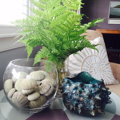
Then think ferns.  Wild ones, the ones you see growing in the woods or other damp places.  They are  a constant in my summer decor mostly because I don’t have ready access to cultivated options and also because I love to create interest and a homey, nature inspired look without spending money.

Living on the edge of the ocean, in a meadow with thick woods behind me is the perfect spot for foraging for bargain accents.   I often combine sea related objects, some found and others hand crafted.

ferns, sea urchins, pottery, beach decor, summer house

Another trick I use is to continually move around objects I have to create new looks.  My summer place is small and there isn’t a lot of storage for “accessories”.  The candle replaced the sculptured vessel in the photo  above.   
.   
ferns, sea urchins, pottery, beach decor, summer house

 Then an old oil lamp replaced the candle.  So three objects different heights, different textures and different shapes is a simple formula for display.  Another trick is to mimic the shape of the table in one or more of the objects.  The circle is repeated a number of times in this vignette.

ferns, sea urchins, pottery, beach decor, summer house

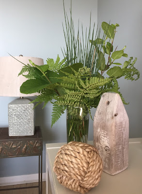
As the ferns started to wilt,  I removed them and cut some grasses and alder leaves to flesh out the display and moved it to another spot.  Leading the viewer’s eye is another great trick to use for simple displays.  Your eye pops from the rope ball, to the bouy and then through to the ferns and lamp.  Again I have different textures, heights and shapes.  The added texture of the lamp base and the table creates a very inviting vignette.  

If you don’t have a meadow or woods near you buying several ferns at the florist has the same effect.

Do you have a favourite go to wild plant to use in your  arrangements?

The post Thrifty decor: Bring on the green appeared first on Decor Pur.

Saturday, December 17, 2016

St. Patrick’s Day gets lots of attention where I live because so many of us have Irish roots.  While the partying and music happened last weekend, I’m doing my own bit today by recommending green as a colour to consider in decor if you like to bring the outside in.  When someone says they hate green, I’m  flabbergasted.  How can you hate the the most prominent colour in nature?

You can have a little green woven in with any other hues and it always looks good.  Think plants.  Is there any room a plant doesn’t work in?  Or you can have a green statement piece or green accessories mixed with another colour.  The possibilities are endless when you think about the variety of greens and the proportion of use in a space.

A green statement piece 

green velvet sofa, white walls
source 
A green velvet sofa is daring and this one sings because of the white walls and light artwork above it.  
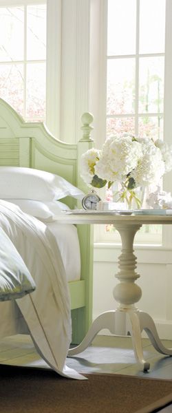
mint green wooden bed, white walls
source 
This is still a statement in an otherwise white room,  just a more subtle one. 

Green  furniture and accents 

white walls, green accent wall, green sofa, leaf roman shades
source 
I am more drawn to yellow greens like the ones in this space.  Love the leafy references in pillows and romans.  This much green needs the relief of white walls.  I would like to see more of the blue green as a stronger punch of colour.  

Just a hint of green in a neutral space 

green plants, white walls, white furniture
source 
Just the merest hint of accents of green with plants and branches can liven a white space. This little amount of green only works well in very light space. 
neutral bedroom, striped bedding, green throw
source 
You can weave  a little more green into any neutral space and it can either sit back and  quietly warm it or…
yellow green accents, gray bedroom, texture
source 
say, “Look at me, I’m the life of the room”.  I’m particularly fond of this colour scheme and the use of texture in the space. 
I guess you’ve figured out from my photo references that I like green with white and gray.  It’s the fresh punch that intrigues me, and for that you need a quiet background.  There are other ways to work  with greens  using lots of black for instance, but then the room gets too shouty for me.  Are you a lover of green?  

The post Bring on the green appeared first on Decor Pur.

Wednesday, December 14, 2016


And continuing with thoughts of spring decorating….

When you enter my house the dining table is in full view from the entry.   In a desperation move while babysitting my 3 granddaughters, I  stuck some fake lavender in a glass jar and thought that I could get away with it.

 I was called out on that move by a family member who was a little horrified I had fake flowers.  I admit they were not good fakes.  I defensively pointed out I had beautiful fresh, pink tulips on my kitchen table, but I was caught.  Time to make amends.

Something green 

Nothing denotes spring like new growth, green and/or plants.

ferns , lantern, spring decor, centrepiece

Lately I’ve been seeing live plants in lanterns.  I like the look and feel, but my place is not a lantern kind of home.  I already tried the plainest one I could find, and moved it all over the downstairs rooms to no avail.  It went back to Pier 1.


glass lanterns, ferns, centrepiece, dining table

I love repetition as a design statement so it’s little wonder I’m attracted to these ferns. Lanterns just won’t do, but repetition is possible. 

Keeping it simple

So I decided to keep my dining table decor simple  by choosing three green things massed together in a small trough planter.  I’m talking ferns, real ones.

boston ferns, trough, centrepiece, dining table

I’

Three small  Boston ferns, and one trough planter that is very wabi sabi (lots of cracks and rough textures to play with the ferns).  I tried them in the planter before coming home with the lot.  The candles and silver leaf bird were leftovers from Christmas.  
silver leaf bird, candles, boston ferns, trough planter, dining table, centrepiece

 Tried the green candles, a no go for me.  I wish the bird was a little smaller, but that’s what I have!

candlesticks, silver leaf bird, trough planter, boston ferns, centrepiece

Still playing with the arrangement.  This will go on for weeks every time I pass the table.  Some day soon I’m sure the lot will end up  corralled in a gray or white tray. Things always do on this table.

coffee table vignette, fern, copper bird planter, green tray

Remember this pic from a my friend Gail’s house I featured in this post?   I envy her the copper bird planter.  A planter and a bird all in one – my idea of perfect.

Lots of options 

Now I just have to keep these greedy, moisture seeking things alive with constant watering and misting.  I can see me carting them off to my summer house  for babysitting.  I’m  sure they will see lots of moves in the coming year- ledge in bathroom, kitchen table, window ledge in kitchen, laundry room counter or shelf.  The possibilities are endless.  That’s a lot of decorating punch for less than $ 40. 00 and they improve my air quality! 
Are plants part of your decor plan? 

The post Go green for spring appeared first on Decor Pur.