Showing posts with label Designing. Show all posts

Sunday, December 25, 2016

 I just wrote my 200th post on Designing Home and I’ve had a very laid back Christmas with lots of time to consider what is working on my  blog and what I might like to add, change, or improve.  Here are the results of my mini conference with self:

decorating small living room

Practical posts for  homeowners

 I usually write about  topics that I think  average homeowners are interested in as they go about refreshing  or designing new spaces.  I will still continue  to address these topics  because I can see from my stats that these are my most read posts especially any that address designing smaller spaces. Aren’t blog stats a wonderful thing? I also know that my  largest blog readership is in United States.  Hey, where are the Canadians?

Canadian designer Lori Harrison
Lori Harrison Collection

 
Canadian focus 

I’ve decided it’s time to seriously ramp up my Canadian content. Stay tuned to meet some great Canadian designers over the next year.   I will include product designers (furniture, textiles, housewares etc. ) and also Canadian interior designers and  visual artists. 

 Canadian interior design bloggers list

 I am also on the search to add more Canadian bloggers to my reading list and encourage you to do the same.  I found a good source on Pinterest (where you find everything) that I am wading through and choosing my favourites.  

paterson woodworking fisher table NL
Paterson Woodworking Fisher Table

Local Design

 Newfoundland Labrador has some very creative people and their products can enhance any living space.  You will meet some of them this year as I encourage  my NL readers to buy local, and other readers to spread their wings our way when purchasing.

 
Carol Bajen-Gahm Vestiges

  Fine art focus

Anyone
who knows me is aware that I am also a visual artist  with an art
blog called Painting On.  It is becoming increasingly more difficult to
keep both blogs current.  I am seeking solutions to this problem and I’m sure there will be cross posting or artist highlights on Designing Home. They will support my belief that no home is complete without art.  I also want to write more posts about
the arrangement and display of art in your home. 

 
Google+ 

I just took the plunge and joined Google+ .  It’s a little overwhelming right now, but I hope it will be a community where I can meet other  interior design bloggers.  


Welcome 2014


The post Designing Home Blog 2014 appeared first on Decor Pur.

Wednesday, December 21, 2016

Have you ever gone into someone’s home  and it was so perfect in every way that you were almost afraid to sit down or move?

When everything looks new, co-ordinated and just so, you end up with an unwelcoming and often boring home.   Such spaces can make visitors feel confined and uncomfortable.  Nothing invites you in because when  everything is  perfectly matched objects become a blur.

 Is there a middle road?

What makes an interesting  and inviting space? Do you need a large budget to have a great home?

Fortunately you can have a very interesting space on a modest budget.  It just takes a little ingenuity.  As with most things in home decor what someone finds interesting  or inviting is dependent on their likes and dislikes;  I can only write about what I find interesting in a space.  Here are some of the characteristics I think   create interesting spaces.

It has a collected feel

That simply means that the home has objects that have been acquired over time and in different ways.   It could be objects collected from travels, antiques, personal items,  family heirlooms, original art etc.  The space does not look like you went out to several stores on one day and outfitted the place. It definitely does not look like a model home!

source 

The rooms are arranged for conversation

Nothing is as bad as going to someone’s home and not feeling like you are meant to be there.  You can have that feeling for many reasons, but  it often boils down to not feeling part of the conversation or not having a comfortable place to sit or lay down a beverage.

I would love to spend an evening here chatting with friends.


There’s a mix of old and new

Pristine is not that interesting.  Often when everything is new you don’t appreciate any of it.  You need a yardstick against which you can appreciate the newness, and that means having some things that are older.  Another great thing about  old pieces is the sense of history and intrigue they create.  Visitors are left wondering why the pieces are so important that you’ve decided to keep them.  If you like very contemporary or modern decor, there is still a place to add interesting objects with a history.

Briggs and Solomon 

There’s a mix of hand crafted and manufactured products 

In our world of mass production, it is so easy to forget the importance of the marks left by the hands of an artist and the presence of ideas in objects.  Having  art, fine craft and the hand made is like having a whole pile of interesting people over at one time.  There is a merging of ideas and various takes on the natural and man made world. Then there’s the one of a kind aspect.

Designing Home/Margaret Ryall
Everything in this space is hand made by various artists.   Even the plant was grown locally.

The natural world is referenced  

Designing Home/Margaret Ryall


This unique vessel titled Barnacle by Anita Singh plays nicely with the glass bowl of sea urchins and wild ferns.  The nautilus design on the pillow supports the overall outdoorsy theme in this casual summer house.  The table in the photo above can be seen in the background. 


 Accessories are moved/changed 


Designing Home/Margaret Ryall


Another week and a different  wild flower arrangement  and vessel by Anita Singh on the little  hand painted table.  The objects and flowers add colour, texture and variety in forms to the vignette.  A painting by a local artist peeks out behind the chair, something new to be discovered.  Candles are always inviting. 

Thought has been given to space planning 

The room is arranged as well as it can be given the space available.  The layout is conducive to flow through the space.  There is an obvious visual flow as well as  defined traffic lanes.  There’s variety in heights of objects and  textures. Even a monochromatic colour scheme needs contrast.

 Designing Home

There are surprises to be discovered

I love a bit of the unexpected.   There are all kinds of ways to achieve this.  It could be a colour that you might not think about pairing with your colour scheme.  It could be an a family heirloom, some of your child’s artwork scanned and made into a book, a vase you made in high school art, the work of a friend,  a display of framed post cards from trips you’ve taken arranged in a grid, a piece of furniture in a place where you wouldn’t expect to see it, etc.  The sky is the limit.

How pleasant these doilies look backed with blue and enclosed with white frames .  Such a great way to display family heirlooms.

source 

 I am intrigued by the chain hanging from the candlestick.  Does it have significance to the homeowner? Did a visitor drop it and it’s placed here to keep it safe?  Did the homeowner change her mind just before going out?

source 

 Each piece has its own compartment that acts like a mini frame.  Together there is coherency in the pieces and it is very pleasing to the eye.  My favourite is the white doll.  Where did that come from?

source

And why not end with glowing forsythia, bold in scale and vivid in colour? The arrangement look so great in front of a simple, repetitive composition of fish. 

What tricks do you use to create an inviting home?

The post Designing an inviting home appeared first on Decor Pur.

Sunday, December 18, 2016

  Choosing the right piece of art for you entry can set a welcoming scene for your home.

  When I have the option, I always choose art first and then build a room around it  rather than buy art to match a space. It’s the artist in me, you need a focal point in a room that doesn’t have an architectural one, and art is your most versatile choice.

 I designed this small space several years ago, but it is still on trend today. Here are some elements to think about before making an art purchase for any space, but in particular small spaces where you many only have one piece of art.

Scale

This  contained front entry is a narrow space with a high ceiling. The bench is low and dark and was to the right of the door.  The table  also dark was to the left of the door.

Always choose work that mimics the shape of the space you are filling.

 In a smaller space I often use one piece of art rather than an array of smaller pieces, but that’s personal preference.   The vertical orientation  of this painting helps bridge the space between the low bench back and the high ceiling.  The vertical lines of the trees also helps move the eye up.

The width of the painting is roughly 2/3 of the bench width.  This is always a good proportion.

Colour 

The walls are a cool blue grey and were part of the original colour scheme of the house.  Cool colours in an entry with little light can lead  to a depressing space.  One of the best ways to move a visually cool space to  an inviting one  is to choose work that has very warm colours.  There’s also nothing like nature’s colours to warm a space. 

Repetition
Once I  chose the art for the focal point in this space,  I moved the colour around in the pillow and flowers on the opposite wall.  Also note the repetition of the diamonds from the bench back to the orange pillow  and the cut crystal vase.  The vertical lines in the tree trunks  are also reinforced in the tall, sparse floral arrangement and the lamp.  Even the verticals in the door frame are doing their part in repetition.

Contrast  
This is where your space will sink or swim.  Every room needs contrast or will be boring.  Contrast creates layers/depth and helps mover your eye around a space.  The dark woods in this space stand out against the light walls. The white flower, dish, lamp shade and trim work stand out against the walls and the darker wood. 
Subject matter

Choose images you connect with and forget about what everyone else thinks.  If a work doesn’t speak to you why bother to have it? 

Finding just the right piece of art is always a challenge, but in my mind the right piece can make a whole space sing.

The post Designing Home appeared first on Decor Pur.

Friday, December 16, 2016

We are out the other end of our IKEA kitchen design & install and hindsight, as you know,  is a wonderful thing. Our family joke is now we are ready to tackle an IKEA kitchen. This is the first of a series of posts around the design and installation of our new kitchen.


 Design is key

Without good design any reno is throwing good money after bad.  If you haven’t really thought out how you want to work in your kitchen,  and how you want it to look overall, no matter how well you install it, you won’t be happy


 I hope some of my musings, and what I learned as I worked through the design process, will be helpful to you if you are planning an IKEA kitchen as a renovation project. 


Get what you want by designing well 

Know what’s hidden


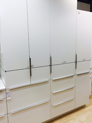
Know the bones of your kitchen  so there’ll be no surprises. We wanted 90 inch pantry units and had a bulkhead with pot lights in it.  I kept nagging my husband to have a look, and I was so glad because to our surprise we found vent work.  Just enough to cause me to move to 80 inch pantries.  Not a happy camper letting go of my floor to ceiling pantries, and needing more filler pieces to accommodate what was available in that height pantry.


We were also planning to keep our current footprint and we knew that the flooring did not extend under our cabinets. 


That meant we had to get all our cabinet measurements correct and use fillers to make it come out even.  If you have an island or peninsula and are keeping your existing flooring,  it is even more important to do careful measurement in terms of depth. We found out we could not have a toe kick on the back of the peninsula so the cover panel had to extend to the floor.  

Analyze your current kitchen 

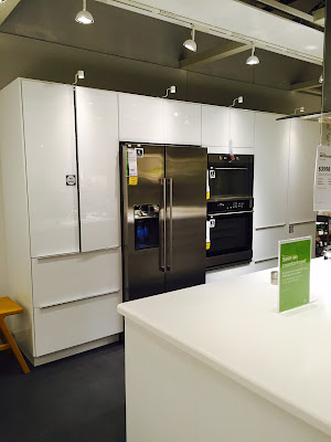
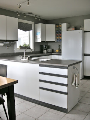
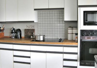
Make a list of what works and what annoys you in your current kitchen layout.  For everything that annoys you, you should try to come up with a solution if possible. It is easier and more cost effective  to keep appliances where they are, but sometimes their placement is part of the inefficiency. Our cooktop and oven were in a major traffic area, and it was downright dangerous when we entertained.   You could also see the stove top from the dining room; I am not a tidy cook. We chose to flip the refrigerator to the cooking area, and make that area into a wall of pantries with the refrigerator centred.  The perfect solution to storage in a walkway.


80s kitchen, European cabinets, updating European cabinets
80s cooking area 
pantries
Standard sizes for pantries 

pantries
Fridge and pantries

European cabinets, 80's kitchen, updating european cabinets
80s layout of kitchen across from cooking area 

Moving appliances meant hiring an electrician, but it was worth it. 


 Everyone expected me to move my sink under the window, but that would have meant a very squat prep area if the stove moved to where the fridge was.  When I stand at my sink now I have a view of two prominent St. John’s landmarks – Signal Hill and Cape Spear.  Why would I want to exchange that for a view of my neighbour’s house? Now I have a huge prep area and I can make all the mess I want when I entertain.  Perfect planning!


Several friends brought up the idea of “updating” to an island.    I like my kitchen to myself when I cook, even when I entertain.  No island for me, and it could have happened in the space without too much effort.  Personal choices are important in design.  I made an entertaining hang out area by removing the half wall in pic below and opening it up to the family room. 


Another big problem for us was  a bottleneck area  at the end of the peninsula because of a contractor error in the initial construction. The wall by the oven was  built 10 inches too long and changing it was complicated and expensive because it contained pipes, heating and air exchanger vent work, plus light switches.   When we redesigned we took three inches off the length of the peninsula to open up the walkway.   That was possible because we had floor tile left over.  


Visit an IKEA store 


By chance we ended up grounded for 24 hours in Toronto when returning from a trip.  We took advantage of that time ( a year before our reno) to check out everything kitchen related.  I took over a 100  pics of things that interested me, and  I kept referring to them as I designed.  If you can’t do that, find someone who has designed and installed an IKEA kitchen and go for a chat.  I managed to find two people who were obliging, and it was helpful even after the store visit. 


Start a reno board on Pinterest 


Look at various IKEA kitchen layouts and cabinet styles online.  Think about  improving storage options especially if you have a smallish kitchen.  Pinterest is a great resource and you can pin everything you see on one board.  Consider a secret board so you can make comments and track ideas or a shared secret board if you have a design partner.  Check out my Kitchen reno board here and a previous post about Finding your decor style.


Find inspiration pictures


Your kitchen should meet your needs in style and function.  Make it yours.  Here are two pics that helped me refine the look I wanted. They are not everyone’s cup of tea!


Create a vision 

Many people just go headlong into a reno and don’t stop to think about their design aesthetic.  What kind of feel do you want in the space?  What style of cabinets and layout suits that feel? What is the rest of your home like?  Are there interior aspects of the cabinets that will add to how you want to feel in your space? 


After all the cabinets and gray horizontal lines in my old kitchen I wanted something  visually quieter this time around. 


 The two photos above illustrate “the feel” I wanted : uncluttered, quiet, airy, bright, calm and minimal,  but with elements of warmth and nature. These are the words I kept in my head throughout the design process.  I wrote them  down and checked my decisions against them constantly.  You will probably have other words entirely, but have  descriptive words as benchmarks for decisions.


I really wanted a kitchen that flowed from the rest of our house  and reflected our arty, organic and calm decor style. 

  • Uncluttered …lots of thought to interior storage options and eliminating “stuff” you don’t need 
  • Airy … an absence of upper cabinets so your eye moved around the space 
  • Calm and bright…  from colour and style choices and layout
  • Warm and quiet …   no laminate, granite, or other hard surface counters 
  • Organic…  from natural products like wood, cork, plants etc.

 Stick to your vision 


A reno is a headache in many ways, and you will reach a point where you are fed up and want to take the easy way out.  Don’t.  Take a break from it and look at the problem with fresh eyes.  Make all decisions based on your initial concepts for the space.  

Work out a rough sketch on paper

Perhaps it’s my age and my visual art training, but I begin everything with paper and pencil.  I found the kitchen booklet  we picked up at IKEA a great help when doing this because all cabinet sizes were listed and you could plainly see what was inside  each one.  There is an online version.  I didn’t spend a lot of time at this stage,  just enough to decide on the flow and placement of drawers or doors. 


Refine your sketch in the kitchen planner


I work  with design apps all the time, but I found the IKEA kitchen planner very frustrating.  It had lots of little glitches, and if you have an island or  peninsula as I did, the cabinets kept wanting to line up by a wall.  I was also working on a MAC.  In the end I refined the plan enough to send to IKEA and get the order made, but it never looked pretty.

 Imagine working in your new kitchen 

Once you have a preliminary design in mind, consider it the next time you bring home groceries.  Is there a place for everything.  If you are entertaining, is there a place for all those things you only use every now and then?  Prepare an imaginary meal and clean up. Are your movements efficient? Have you solved all the design issues in your previous kitchen?


Explain your design to someone outside your family 

Walk through your design with someone outside the family and explain your layout decisions. This really helped me confirm that I wanted things the way I thought.  You also have an opportunity to question the IKEA staff when you order your kitchen. They were super helpful when I called.


Record your questions before IKEA ordering 


I had at least ten questions recorded for clarification when I called to place my order.  Many of them were of a confirmation type, making sure I had interpreted the cabinets properly and that I could do what I wanted to do. 

And yes, you will have more than one design.

 I’m happy to answer any questions or hear your comments about your IKEA kitchen design suggestions. 


The big reveal is coming up in the next post and yes, it was worth all the thought, frustration and mess…. 


The post Designing your IKEA kitchen appeared first on Decor Pur.