Showing posts with label blue. Show all posts

Saturday, December 24, 2016


 It seems like only yesterday I  wrote my  2013  home decor trends  post,  and I’ve already looked at Pantone’s Colour of the year, Radiant Orchid, and suggested  ways to integrate this vibrant colour into your decor. What else can we expect in the coming year?

While Radiant Orchid is Pantone’s colour of the year, I think it will be the blues that will take over the stage in 2014.  Joan Mitchell had this all figured out in her 1972 painting!  She painted the best blues ever and these are the ones you’ll be seeing more of in 2014.
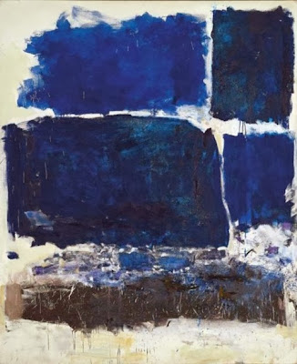
decor trend 2014 blues
Joan Mitchell, “Blue Territory,” 1972
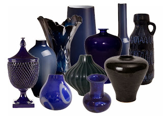
 And here’s a modern interpretation of the darker side of blue…


2014 blue trend home decor
A range of blues for 2014


This year the popular blues are much deeper leaning toward cobalt and navy.  But what can you put with so much blue? 

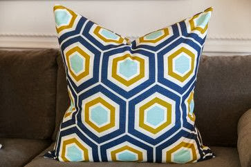
decor trend 2014 blue and yellow
Add yellow as an accent in 2014

decor trends 2014 navy and gold
Gold accents work well  with navy blue and cobalt

And don’t forget vibrant oranges or greens with dark blues.  The sky is the limit with this colour.  I thought the art work in the mood board above gives lots of accent choices. 

navy blue cobalt blue 2014 trend Designing Home
Versatile green blue looks great with white and radiant orchid

And never forget that blue has a green side that mixes with all sorts of colours especially the pinkish purples like Radiant Orchid. That way you can bet two trends for the price of one.  Think turquoise, aqua and any blue you may see on a Caribbean holiday.


Benjamin Moore highlighted the lighter side of blue for their 2014 Colour of the year. It is reminiscent of summer breezes blowing lightly under a pale sky. Cool and inviting and perfect for a summer house or a spa retreat.


It seems all versions of blue are hot this year. Is there blue in your future? 

The post Blue- A home decor trend to watch appeared first on Decor Pur.

Friday, December 16, 2016

source


I spend part of every year living on the edge of the Atlantic Ocean in a small community in Newfoundland.  Being in such close proximity to the sea influences my colour interests.  It is no surprise that I like watery blue greens. These combinations show up in both of my homes and even in my art work.   

  Margaret Ryall, Slow Drift (2012)  6×8 in.  encaustic monotype on board

 Lisa Sherry
When you mix spring greens and  watery blues the result is always  fresh and lively. There are lots of patterns and textures in this room and the use of an old map as wall art references  land and sea.  Are you beginning to see how both of my careers dovetail?  Interior design and visual art feed each other on a daily basis in my life. Lots of times looking at a room will give me an idea of an art series!

source
This is lovely combination  inspired by the spectacular art work over the sofa.  The room is fresh and inviting and the plant adds to that vibrancy.  White, cream and the softest yellows  are the perfect foils for blue green combinations. If you would like to see more of this room check the link above.
 source
Yellow brings out the best in aqua because there’s yellow in its composition . The magenta area rug grounds the design, but for me it has to much energy for a bedroom.  I like my floors muted and just there. Do you like this combination?
 House of Turquoise
A vibrant, casual  sun room in blues and greens.   Just the place to sit and have a cool drink with friends. The colour scheme helps to draw together the variety in furniture pieces. Don’t be afraid to use what you have in a room and then  use colour to link the design together.  Matching furniture  is highly over rated!
Waverly Solar Flair Lime/Indigo
Look to fabrics for colour scheme inspiration.  Deeper blues can serve as a good grounding colour in a blue green scheme.  If you like painted furniture choose this colour for high impact . Deep blues are trending for 2013.  
Good Housekeeping
 Christopher Farr
 
Or reverse your combination and use a striking aqua colour and support it with deep blue. Not everyone can live with this much pattern, but you don’t have to.  Imagine this piece against  soft creams, charcoal or even purple!
  
How do you like your blue and what’s your favourite combination? 
As you can see I like mine with lots of yellow and leaning into green.  Check this fascinating survey to see how people feel about blue depending on sex and age.

The post How do you like your blue? appeared first on Decor Pur.

Saturday, December 10, 2016

Hopefully you are into blue!  Blue seems to be a dominant colour in Pantone’s colour forceasting for  both spring 2013 and upcoming 2014. Here’s how it’s playing out….

 Monaco Blue (Spring 2013)
 Dazzling Blue (Spring 2014)

Two blues, but with great differences.  I can’t say blue is a big favourite of mine, but I am really into Monaco blue because it is a warmer blue that is approaching navy. I don’t think it is a blue that you would  catagorize as trendy. Perhaps timeless would be a better descriptor.   Dazzling Blue seems to be a colour that will not be  around for the long haul.  It is cold, quite exciting ,and lends itself well to accessorizing.   It isn’t exactly a colour you snooze to.  Could you have it on a wall?  Not me, but there are those who would.  

You could use it a little or go whole hog and saturate your space with it. 

 Welcome to the world of dazzling blue….

 
source
 …. put it on the outside
 
source
on furniture or pillows…

 I really like it mixed with various grays and all that texture.  Both serve to tame it down a little.  You will notice quite a bit of colour variation in the blues above. Mixing a more vibrant dazzling blue in with “tamer” blues seems to be a good solution if you aren’t into bright. 

 
on a wall….
 Whenever I see these fresh, intense blues my mind goes to warm countries like Greece.  Since I don’t live in one, it could explain why I am having trouble warming up to this selection.

source
or a poof…
This is a truly dazzling accent piece that could find a home in most decors.

 source
 in glass or flowers…

source 
and tile …

source
on chairs …

 or bowls…
 source
 or a pillow with lots of other fun colours. 
 source
And here it is with Celosia orange another Pantone selection for spring 2014.
 
These colours  show up on the runway too! 
Which type of blue decorator are you?


The post Are you feeling blue? appeared first on Decor Pur.