Showing posts with label colour. Show all posts

Thursday, December 29, 2016

Ah, the dreaded question.  What colour draperies should I have?

Part of being a decorator is making informed decisions about design.  Keeping current with trends  through reading and viewing is a must, but trend knowledge is not enough.  You have to understand what affect your choices will have on a space.

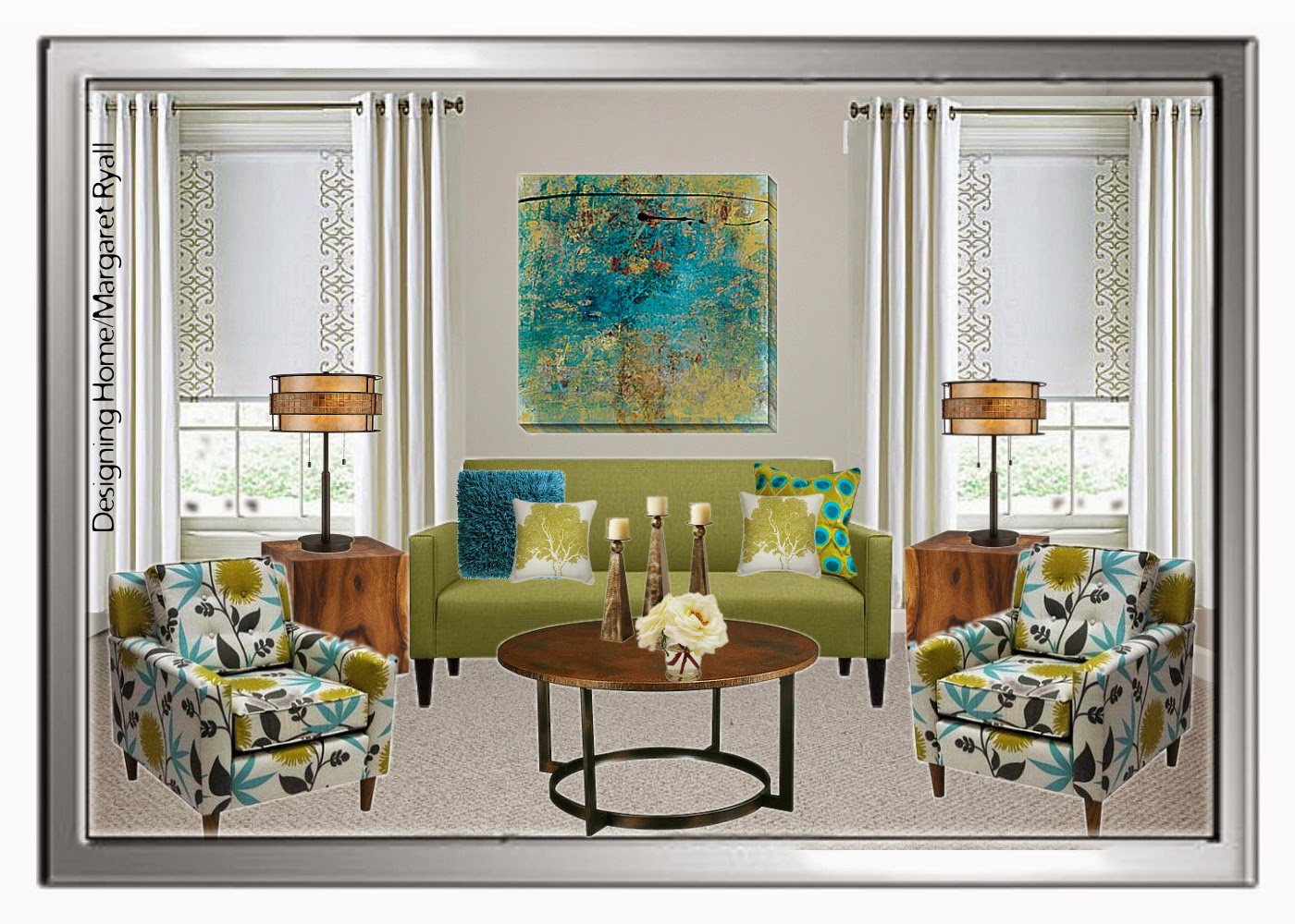
I posted this picture on Designing Home Facebook Page as an example of a style board I create for clients.  I am not one for vivid colour, but I didn’t have to live with the colour, a young lady who loves rich colours did.   Should I have argued with her and said you shouldn’t have bright draperies. NO!  I have to balance my client’s likes with the principles and elements of design.

vibrant drapes, turquoise drapes, vibrant living room, Designing Home
Vibrant  draperies 

Let’s look at what this colour choice  did for this room.

 You can’t ignore this window treatment, it’s not only the vibrant colour, it’s the placement and amount of it. That means a lot of colour jumping forward in the space. The draperies also serve to  frame the artwork and the sofa. The more muted sofa is anchored and held captive, and you need an equally vibrant art work to compete with the windows. When you look at this space blue is primary and everything else is secondary.

The overall effect is focused and the room appears smaller than it actually is.  That’s a great tip if you have a large space that you want to appear smaller/cosier.  Go for darker/brighter  window treatments that draw the eye.

 I see this as a lively, energetic scheme that is equally matched to a sparkling, vivacious young lady.

On to number two example….

soft white drapes, roman shade, fresh living room scheme, Designing Home
I removed the vibrant draperies and choose something more in line with my personal taste.  I like my spaces to be expansive, and tone -on tone- window treatments  (keeping the colour of the drapes and the walls very similar) is  one way to achieve that look/feel especially in a smaller space.  
Now the sofa and artwork stand out as they didn’t before.  Your eye connects the light colour in the chairs with the draperies and you visually wander the space. 
On to example number three….  
fresh living room scheme, fresh green, turquoise
Same window treatments, but I’m tweeking a few other things. Without the blue pillows on the chairs,  and the blue vase on the table, the space is even even more opened up.  The overall effect is fresh and inviting,  reminiscent of a summer garden – always a look I gravitate to.  The wooden tables help that feel too. 
So there is no right answer to the question “What colour draperies  should I have?”  It all depends on how you want your room to look/feel. 
If you wan to find out more about current trends in window treatments check out this post and several others in my side bar. 
What’s your preference when buying  window treatments ?  Are you a neutral or a colour lover?

The post Choosing a drapery colour appeared first on Decor Pur.

Tuesday, December 27, 2016

There’s nothing like the end of a year to make you hop around in your thinking.  While I’m busy considering the colour trends for 2015, I’m  also looking back to see connections and possible threads that can make these new colours have a little more staying power.

I’m interested in creating fresh looks through creative use of what is in a home, energized  with a few new purchases.  To pull this off you need a long term view of what is happening in the world of colour.  

Last year dark blues were prominent in  many of the images you saw in magazines and online, first appearing in Pantone’s fall 2013 predictions.  That is still a strong look and one that  will  hang around for awhile.

If you look at Pantone’s spring  2015 predictions you will see several tints/shades of blue.

Pantone colours spring 2015

source

My favourite is 4 Classic Blue because it is crisp and deep without being too cold.  Check out  this combination of dark blue with natural colours.

Designing Home; colour trends 2015, modern country

There is also a fresh take on the “old” country look emerging with clean lines, less clutter, natural materials and prominent textures mixed with lighter woods.   Think pared down Pottery Barn.  I’ve packed a number of possibilities into this style board, but you wouldn’t want to use them all in one space.

colour trends 2015, olive green, Scandinavian , Designing Home style board

My personal preference  is more a mix of West Elm meets the Scandinavian countries. Notice the olive green which will be big in 2015.

Designing Home, Margaret Ryall, style board, colour predictions 2015, olive green

This colour would work just as well as the dark blue in the Modern Country look.   And it is so sharp with black and cream.

Pantone’s 2014 colour of the year Radiant Orchid came in like a lion, and obviously went out like a lamb because apart from what I saw online, it did not impact my life or design practice in any way.

 I actually liked this colour where many designers didn’t.  I’ve always loved those redish purple hues especially in textiles, but not so much in furniture.  If you bought into this trend, it is easily updated and made even more interesting when combined with yellowish greens.   Just check out the pillow lower left  for an indication of this blend as well as the rug and artworks.

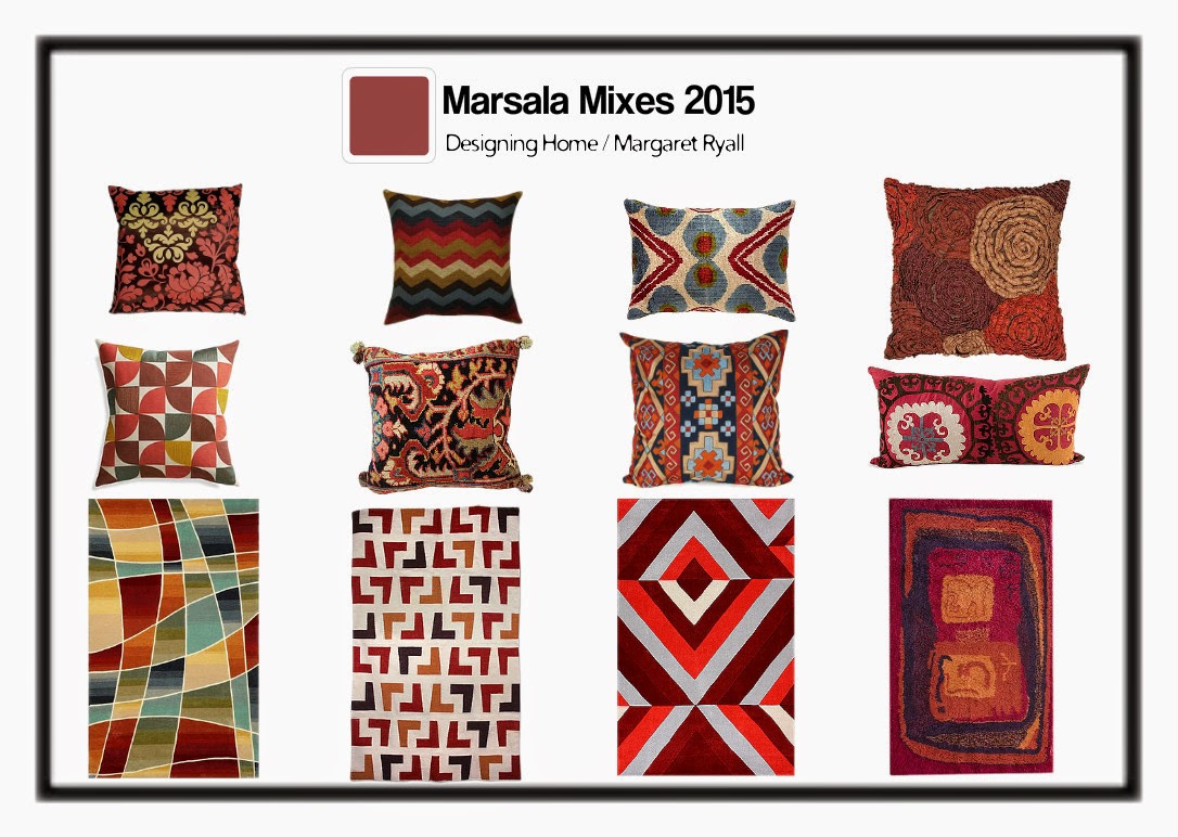
And now for 2015 Pantone is staying in the same arena with its choice of marsala, but definitely browning it down quite a bit to create a heavy bodied colour.  Again not a favourite of many designers.

Pantone 2015, marsala, Designing Home, Margaret Ryall, style board

 I’ve seen combinations of it with a variety of blues even cool ones and they all look fantastic. It also looks great with the oddest combinations as you can see below. I’m particularly loving it with blues and light creams.

Pantone 2015, marsala, Designing Home, Margaret Ryall, style board
Who knew it would work so well with orange and coral? 
Since I only spec Benjamin Moore paint colours in my business, I am always interested in their colour trends. 

Benjamin Moore’s  2014 Breath of Fresh Air at least supported the spa/beach vibe that is still a go- to look with many homeowners.  It is a versatile colour that looks great with pearly grays, driftwood colours and soft or chrisp whites.  It also combines well with marsala and the current  Benjamin Moore colour for 2015, Guilford green.

 How can you possibly go wrong when you have two obvious “earth” colours like blue and green.  Nature never makes mistakes!

When you consider the metallics in your home, the move to warm metals is even more pronounced this year.

source 

Brittany Makes Blog 

source 

 In  European markets  copper and pink gold are hot commodities. They are not as versatile for all over use especially the pink gold which always comes across as very delicate/feminine.  

source 

 In North American decor golds and  brass are prevalent. I’m fond of a more burnished look with these metals.  I can’t seem to bring myself around to the shine of yellow brass – too much history. The yellow metallics look great with greens, dark blues and brownish reds like marsala.  And mixing metals is still very trendy.  Go for it.

Lots of connections.  Do you ever consider colour trends when you decorate?

The post Colour Trends: Looking back and looking forward appeared first on Decor Pur.

Wednesday, December 21, 2016

Some colour schemes are a dime a dozen and others are just daring and interesting. Today I’m looking at salmon/coral/melon and pink/rose/magenta.

Now I’m not saying I would use these colours in my own home. You can appreciate from afar without committing!  These rooms have just too much colour for my personal style.  I’m attracted to them because they are so vibrant and fresh.  Isn’t it a good thing we don’t all like the same colours?

 How do you feel about these rooms?  If you could transport any of them into your own home would you?

This colour scheme seems to be most popular in bedrooms. 

 Interior Designer Artistic Designs for Living, Tineke Triggs

The white bedding  and accessories work well to balance the hot colours.  White has many uses in decor and acting as a backdrop is just one of them.


You can’t deny that these colours are great for a kid’s room.  I’m really liking the hit of lime green as an accent.


Better Homes and Gardens

This is the subtle version of this scheme.  Just a hint of melon with a deeper pink. Both are tempered with lots of off white.  That seems to be a common thread through most of these rooms.
Phoebe Howard

More vibrant colours against light walls and furniture. The pink is leaning toward purple and there isn’t that much of it. 
Jessica Lagrange
 This room turns it around and focuses on a rich magenta with smaller pops of orange. Do you think the headboard is dramatic enough or would you like to see a big piece of art over it?


Do you fancy one of these?
Living rooms


 Better Homes and Gardens

 Lots of white to play with these two vibrant colours. I’m longing for a little more pattern, perhaps a stripe with a third colour thrown in to replace the pink cushions. 

Here are some choice….

I would go for the purple one. How about you?


 While we’re at it what let’s think about the white vase… Hummm…

Choose one.  No matter what pillows you choose there’s a vase that works.

  Can a room be over matched?  YES!
source

Deeper
pink leaning toward red with just hints of orange give a totally
different look.  In this room a neutral tan  in varying values serves as
a backdrop to the vibrant colour. I like the fact that this room is not
too over matched.  Lots of pattern in the pillows.


Simplified BeeĀ®: Sweet, Modern Pink & Orange Nursery Room for Baby...

Simplified Bee®: Sweet, Modern Pink & Orange Nursery Room for Baby…

Go for it !

The post Not your average colour scheme appeared first on Decor Pur.

Saturday, December 17, 2016

My choice for kitchen cabinets has always been white because I just don’t like living with dark colours or too much wood grain. I liked white before it became popular; I fought the natural oak trend when we built our home in the mid 80’s and now that  dark stained cabinets seem to be the going trend where I live, I continue to love white.

Just how popular are white cabinets?

  I decided to conduct a very unscientific poll using the kitchen section of Houzz.   I looked at the first 50 pictures of long views of kitchens  sorted by most popular today and here is what I found out:  Of the 50…..

8% were  natural wood or stained wood

 There was a mix of  stains…
 Laurysen Kitchens Ltd.
….from this very dark espresso like colour …
Paragon Kitchen & Bath Studio
…. to a mid value cherry….

Christian Gladu Design

…..to natural wood .
 14% were painted colours other than white/cream  

 Photographer Maxine Schnitzer Photography
Most of the cabinet  were lighter colours so this black  kitchen stood out. I think it works in dark because it is open to a much larger space and there is a liberal use of light creams and white. Working with dark cabinets has to be a balancing act or you end up with a cave.


T Architect Kemper Associates Architects, LLC

Yellow was perhaps the most  unusual colour choice   of the fifty surveyed kitchens and you would really have to love yellow to live in this kitchen. 

 Natalie DiSalvo

 You can never go wrong with a soft colour for kitchen cabinets.  This creamy green is light enough to open up the space, but you can still define it as a colour.  I think it was a good solution in this Craftsman style house where the traditional finish would have been stained wood.

JLF & Associates, Inc.

Who would ever think of a grayed lavender as a cabinet colour, but it really works in this atrium kitchen. The wood tone in the medium stained island  is repeated in several places throughout the space to create visual harmony. Grays with purple undertones actually work really well with mid toned woods, but it not a colour everyone likes. 

22% were white/cream with dark islands
 

Kitchen And Bath Venegas and Company

I think the darker island concept with white kitchens works really well  to add drama to a space. This  dark colour also grounds the room and integrates well with a darker hardwood floor.    Oh, to have all those drawers!
 Great Spaces!

Of the darker islands, the most prevalent colour was a deep stained brown.

 
2 % were white with a lighter coloured island 

 Birmingham General Contractor Structures, Inc.

Barnes Vanze Architects, Inc
 I think the soft blue/green works great with the wood tones in this very Mediterranean  styled kitchen.

54 % were white or off white
  

 Shuffle Interiors

 Of the kitchens I showed did you notice what the most popular floor treatment was?

And there you have it.  What’s your favourite cabinet finish?


The post Kitchen cabinet colour trends appeared first on Decor Pur.


 Colour is the least expensive change you can make to your space and still have huge impact.   Certain colours often get a bad reputation because they were overly popular at a certain period.  No colours get more ridicule than the salmons, corals  and peaches because they were everywhere is the mid 80’s.  But don’t let that stop you from using them. It’s all in the pairings.  These designs are timely and inviting.   What do you think?


Salmony orange  with charcoal gray can be extremely elegant and contemporary. 
Many Turkish rugs use salmon as one of the main colours which makes
this a timeless colour.

 
 You can put any colour with black and white and it looks stunning.

 
 And with white and soft gray this version of orange  is positively fresh.

 If  you like something a little more restful consider muted oranges with  earth tones …

 
like in this lovely living room…

or mix in blue with earth tones like the bedroom below. 

 I would mix  these colours with an cream walls but the blue works well too.  Colour is such a personal thing; I never want to see too many colours in  a room where I want a  restful look.  

   A crisp look with a salmon /tangerine combination.
 
And for a girl’s bedroom mix it with a pale aqua.

or  with true blue and white  in a living room…
  

or even with a muted purple in a bedroom or nursery. 

But I’m trying to warm up to mixing it with greens.  Too many memories there ….


especially this particular green

source

 I’m perfectly fine with it in a kid’s room…. and a few hints of magenta would liven it up and make it more current.

 source
But I just don’t like the combination when it is mixed with toned olive greens. 

This green is a fresh spring green  mixed with lots of lights and the salmon is deeper  so it gets my nod.
Would you use coral/salmon/peach in your home?

All links to images can be found on my Pinterest board for Colour scheme inspiration.

The post Is coral an 80’s colour? appeared first on Decor Pur.