Showing posts with label space. Show all posts

Wednesday, December 28, 2016

After a long hiatus I am back to Thursday Tips at the request of a reader who liked these short and to the point tips for “small improvements that have big impact”.  For this week my favourite topic – art.

The biggest mistake made when hanging art is not matching the size/shape of the art work to the space you are hanging it.   Work should look “comfortable” in its space not cramped or looking like it is awash in a sea of wall.

art vertical space
Layout follows vertical space
source
 hanging art console
Long console needs substantial work to fill space
source

hanging art stairwell
Perfect  size and composition for top of stairs
source

hanging art bedroom
Size and shape  works with width of headboard
source

hanging art sofa
Art shape and size  follows wall shape
source

And there you have it.  Large works for large spaces or smaller works massed together for impact.  No little pieces lonely on a big wall.  No large pieces squat into a small space.  Oh, did I mention I have a lot of opinions on gallery walls?  I’ll save that for another tip.

The post Thursday Tip # 11 – Art and space appeared first on Decor Pur.

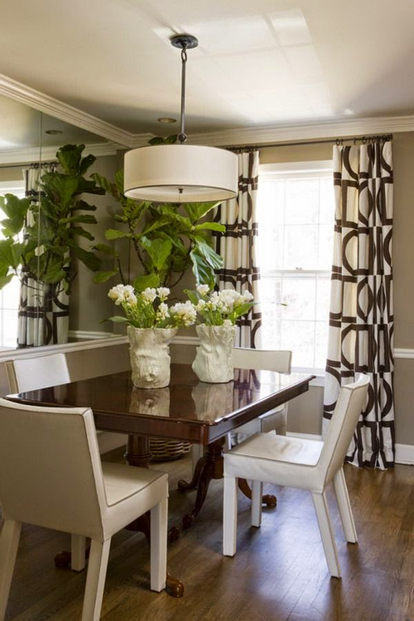
Large can have a lot of meanings, but in Newfoundland large often  mean great or good or the best as in ” it’s a large day”.   Given that understanding here’s  a “large” dining room and a closer look at why it merits that rating.

small dining room, design lesson, tips
Liz Levin Interiors 

This room has a lot packed into a very small space.    Just imagine this space with a matched dining set.  It would blend into the floor and be totally blah.  How did the designer achieve this look? Perhaps there’s something in her kit of tricks that you could use.


Upholstered chairs

  If you have a dining table you love, and hate the chairs, consider changing them  to coloured leather or fully upholstered ones.  It helps break up all the wood that you tend to get in dining rooms.  This approach usually means you can get away without the area rug that many people have to resort to so their set doesn’t disappear into a similar wood floor.

Mixing styles

I know this isn’t for everyone, but if you like a more curated rather than matched look, it’s the way to go.  The days of sets are long gone.

Contrast

Nothing attracts the eye better than contrast.  It is a design fact.  If you want a more neutral space without it being boring use contrast widely.   The dark table, cream chairs, and white and brown draperies work so well together.  Reusing the cream in the centrepiece adds another contrast point.

Pattern

I’m a big believer in using pattern to add interest to a space.  The geometric pattern in these drapes
 mimics other shapes in the room, both circles and rectangles. The colour scheme is replicated in the drapes. The drapes also provide  what I like to think about as destination viewing- a spot for your eye to seek in a room and rest before moving on.  Pattern is often the bow that ties up a space.

Mirrors

A mirror goes a long way to enlarge and add interest to small places. Personally, I like a framed mirror where this one appears to be  adhered to the wall.  Don’t be afraid to go large when you hang a mirror in  a dining space.  A word of caution.  Check what is reflected in it.  Perhaps it might be something you would rather not draw attention to.

 Living things

And most importantly this space has living things in it.  There is nothing like plants and flowers to add a dynamic touch to any space.

Texture

While this is a small space it is packed with subtle textures and sheens: wood, glass, pottery, weave in drapes, and plants.  Texture is the most overlooked design element in many spaces.   If your own space looks blah maybe adding some texture will help.


Fine craft


 I like the form and texture of the vases on the table.  While I don’t know for sure they look like fine craft. Nothing is more boring than a room full of “accessories”  from big box stores.  There’s so many unique, hand built objects in every city and town.  I contend it is more interesting to have one or two interesting objects than a house full of mass produced stuff.  You may disagree.

All of these elements work equally well  in a small space or a large space.

And here’s a space to check out to see if any of the points I mentioned above are present.  It’s isn’t a small space, but you will see a lot of the same elements and principles applied.

Blackband Design 

Lots of points to consider and possible some you might like to play around with.  What are your strategies to create a “large” room?

The post Design lesson: Giving a large look to a small dining space appeared first on Decor Pur.

Monday, December 26, 2016

 I had a refreshing conversation with a client/friend recently about  reordering  and supplementing her space to make it more peaceful and inviting. It brought me back to  what  I  feel is important, and what I am  most attracted to in my own  living space.  My last post explores ways to create a peaceful environment and this one is a follow up.

I want a quiet, peaceful space and I’m constantly fighting my attraction to objects.  I love pattern, texture, shapes and a bit of glitz. After several years of letting myself buy this because…. or that because…., I have areas of my house that are getting just too object driven.  I’m currently in a simplifying phase and I have three guiding principles: 

  1.  Embrace space by decluttering
  2. Celebrate ordinary things
  3. Focus on what you value

Today’s focus is….

Embrace space by decluttering 

 Getting rid of all the excesses in a house leaves a space that is simpler and opened up.   I feel you need to walk that fine line between  owning objects and feeling burdened by them. When you remove things you let empty space occupy the site, and your eyes will seek that openness.

  Do you want a table laden with an array of objects or do you want several meaningful objects? 

Celerie Kemble

 For some people this is the ultimate in a layered vignette on a table top. In my own home, I would find this amount of “stuff” aggravating because my eye has no place to rest. Removing all but several meaningful  objects would create a calmer space. 
 
 Lindsey Bond

My eye is happier moving over this arrangement which has visual interest with its varying textures, shapes and heights, but still feels calm.

 Or this white on white arrangement  with wood tones to break it up.

 My Lovely Things

For a more dramatic look you can have darker or more intense colour, but still have a pared down, clean  look.

 If you love art  it is always a challenge to have just enough to appreciate what you have. Each art piece needs its own personal space just like people.  Cluttered gallery walls are not for  everyone. Less is often more.

Here are several space enhancing tricks with art:

Trouvais
1960′s artwork by Al Held above a Louis XIV gilded settee
photography Roger Davies, Western Interiors April ’09

 Arranging one piece of art over furniture and viewing it from a distance creates a  long view.  Your eye moves over the space that is in front of it in a seeking fashion.  Honing in so to speak. It’s very effective.  You need larger or dramatic work for this trick to be effective. Framing with a doorway is a great way to move your eye through.

Laura Winslow Photography

Use repetition of simple frames and black and white on a coloured wall to anchor work and attract the eye. While there are four works here you view them as a unit.

 
 Source unknown

 Let art work take centre stage.  This room doesn’t need any other art with these three panels.

 Desire to Inspire

 Create a supporting vignette under art but don’t overdo it.  All of the elements of this vignette work together to support the art.  You could remove the books and pillows  for a more pared down look. It depends on how “hard’ or “soft” you want your look to be.

Do you like to create more visual space in your home?  How do you achieve it?

The post Embrace space appeared first on Decor Pur.
Friday, December 9, 2016

Details in decor can make or break a design especially when you have a more minimal look (not a lot of stuff around).  You need something interesting  to draw the eye and provide a  momentary resting place.  It might be a texture, a beautifully shaped stool, or an embellishment.  A space without details is immensely boring and who wants a boring home?   Here are simple ways to add some pizazz to your space. Each  space will have a different starting point.


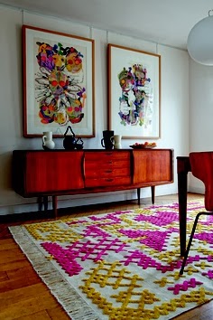
1. Use art  to create a vignette

art vignette yellow interesting space
Eye catching art anchors design
source

Choose eye catching art and use it to create a vignette.  In this space the yellow chair creates a visual flow from the artwork and it is anchored by the stripes in the rug. Books provide a casual look but other items could be added to the bench to continue the tone set by the art.

   2. Add pattern and texture

greek key pattern texture interesting space
Greek key detailing adds interest
source 

The addition of pattern to any space instantly makes it more interesting .  Also consider using texture for a quiet way to add additional interest.

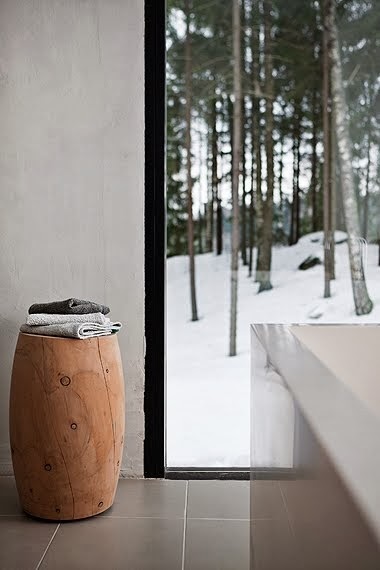
 3. Bring the outside in

wood stool bathroom interesting space
 Add outside materials inside
source

 Who wouldn’t notice the natural wood element in this stool in a hard edged bathroom.  The repetition of natural shapes from outside to inside woks so well to move the eye to the welcoming outside view.

4. Layer furniture and accessories

bookcase wallpaper focal point interesting space
Patttern and colour with accessories create a complex focal point
source

 Some focal points are large and a room is created around them.  Other times a secondary focal point can be introduced in a quiet corner of a space. This solution works when there are several seating areas in one space. Layering furniture and accessories is one way to create interest.

5. Choose spectacular lighting

Tom Dixon lighting interesting space
 Spectacular Tom Dixon lighting
source

 Who could ignore the variety of shapes in these black pendants  that anchor the dining space in an open concept home? There are all kinds of lighting choices to adorn your space.  Find the one that is right for you.

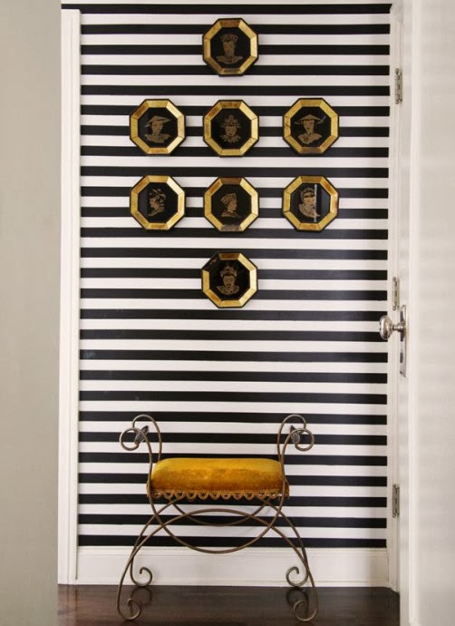
6.  Use geometry

black white stripes hexagons gold  interesting space
 Black and white is always eye catching
 source 

When you combine several geometric shapes in one vignette, it can create a powerful focus.  When you add high contrast it is difficult to ignore.  Pop some gold into the combination and you have to look – more than once!

 7. Use common items in unique ways

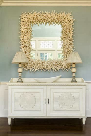
starfish mirror interesting space
 A simple starfish repeated many times
 source

Take one starfish and it has an interesting shape.  Repeat that shape many times by overlapping and you have a sculpture that begs to be looked at and touched.

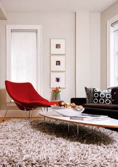
8. Use pops of  warm colours

Red is an eye catcher
source

If you want instant attention choose red, yellow or orange as an accent.  Warm colours beg to be noticed by advancing visually in your space.

Now that was easy.  If you have a space you aren’t pleased with perhaps one of these suggestions might help to create more visual interest. Do you have favourite ways to create interest in your home?

The post 8 Simple ways to make your space interesting appeared first on Decor Pur.