Showing posts with label choosing. Show all posts

Thursday, December 29, 2016

Ah, the dreaded question.  What colour draperies should I have?

Part of being a decorator is making informed decisions about design.  Keeping current with trends  through reading and viewing is a must, but trend knowledge is not enough.  You have to understand what affect your choices will have on a space.

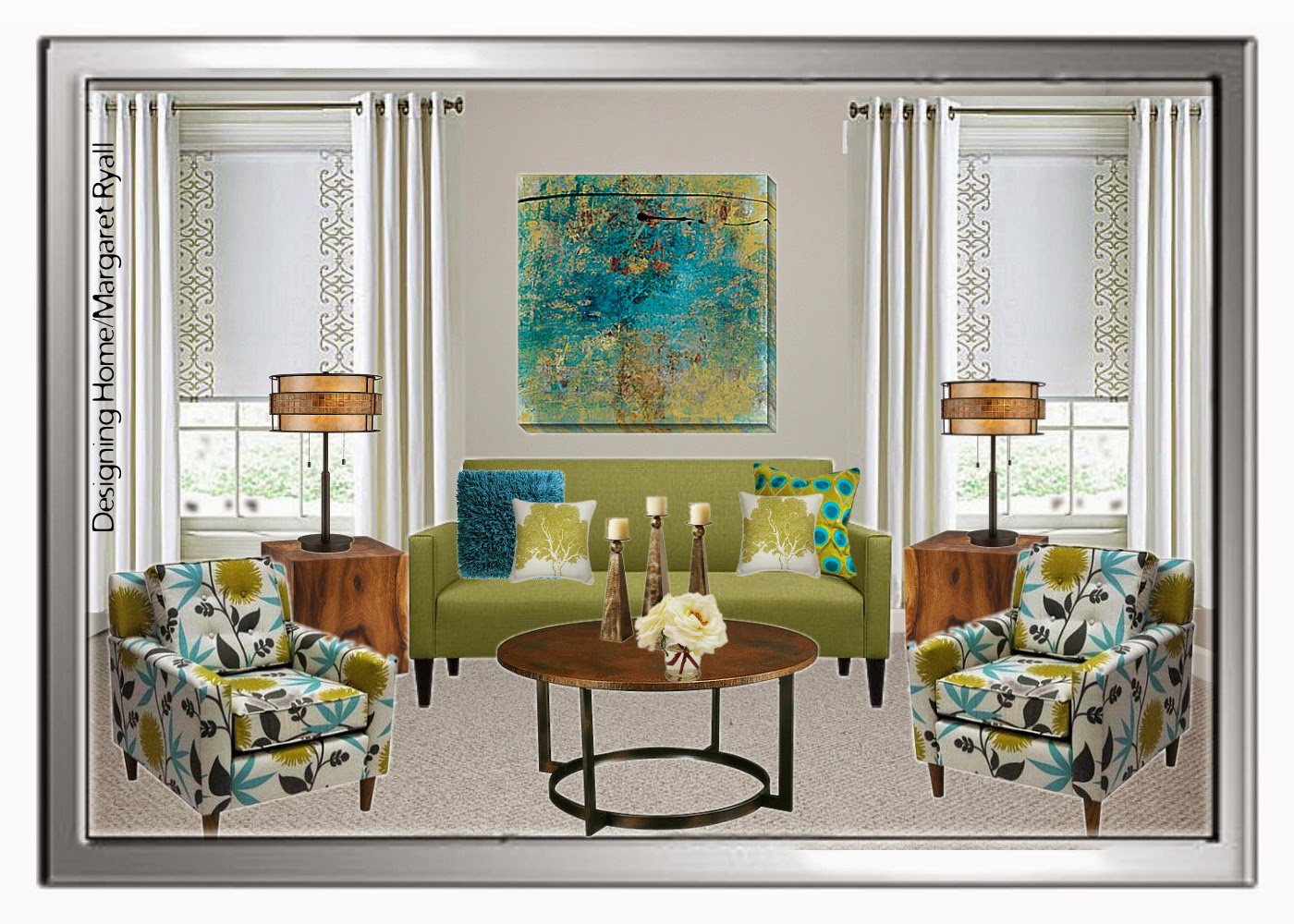
I posted this picture on Designing Home Facebook Page as an example of a style board I create for clients.  I am not one for vivid colour, but I didn’t have to live with the colour, a young lady who loves rich colours did.   Should I have argued with her and said you shouldn’t have bright draperies. NO!  I have to balance my client’s likes with the principles and elements of design.

vibrant drapes, turquoise drapes, vibrant living room, Designing Home
Vibrant  draperies 

Let’s look at what this colour choice  did for this room.

 You can’t ignore this window treatment, it’s not only the vibrant colour, it’s the placement and amount of it. That means a lot of colour jumping forward in the space. The draperies also serve to  frame the artwork and the sofa. The more muted sofa is anchored and held captive, and you need an equally vibrant art work to compete with the windows. When you look at this space blue is primary and everything else is secondary.

The overall effect is focused and the room appears smaller than it actually is.  That’s a great tip if you have a large space that you want to appear smaller/cosier.  Go for darker/brighter  window treatments that draw the eye.

 I see this as a lively, energetic scheme that is equally matched to a sparkling, vivacious young lady.

On to number two example….

soft white drapes, roman shade, fresh living room scheme, Designing Home
I removed the vibrant draperies and choose something more in line with my personal taste.  I like my spaces to be expansive, and tone -on tone- window treatments  (keeping the colour of the drapes and the walls very similar) is  one way to achieve that look/feel especially in a smaller space.  
Now the sofa and artwork stand out as they didn’t before.  Your eye connects the light colour in the chairs with the draperies and you visually wander the space. 
On to example number three….  
fresh living room scheme, fresh green, turquoise
Same window treatments, but I’m tweeking a few other things. Without the blue pillows on the chairs,  and the blue vase on the table, the space is even even more opened up.  The overall effect is fresh and inviting,  reminiscent of a summer garden – always a look I gravitate to.  The wooden tables help that feel too. 
So there is no right answer to the question “What colour draperies  should I have?”  It all depends on how you want your room to look/feel. 
If you wan to find out more about current trends in window treatments check out this post and several others in my side bar. 
What’s your preference when buying  window treatments ?  Are you a neutral or a colour lover?

The post Choosing a drapery colour appeared first on Decor Pur.

Tuesday, December 13, 2016

 Questions  about the wisdom of  choosing dark  kitchen cabinets keep cropping up in my reading and client discussions. Of course there are no absolutes in decorating.  You can make anything work or look good if you have the skills, and using dark cabinets in any room  requires a deft hand.

If you want your dark cabinet choice to work and have the longest style staying power, consider the following:

Let the cabinets shine

dark cabinets high contrast
  source

 When I work with clients who want everything that they consider trendy
in one space, I always discuss the wisdom of this approach.   Something has to be the star in a space and you should decide in the beginning what the star will be.  When you choose dark
cabinets they demand centre stage, and everything else should support them
and make them look their best.  Using lots of white or very light
colours with dark cabinets is the way to go to get that sophisticated,
rich, classy look that many people are after when they choose dark cabinets.  

Use  in open area spaces

dark cabinets open concept
  source 

Dark cabinets work well in large, open area spaces where the wall colours are lighter rather than darker. The dark cabinets help to balance and ground the space. .

Have breaks in the dark flow

open spaces with dark kitchen cabinets

 source

 Leaving lots of wall space free of cabinets and/or having glass with light interior cabinets can do a  lot to balance a darker cabinet colour.  Having contrast with the floor is a must to create a lively space.

Mix dark and light together

mixing light and dark kitchen cabinets

Braam’s Custom Cabinets

 If you are afraid of too much dark but like the look why not do a mix of darks and lights together? 

Questions to consider: 

 Is there enough contrast with the floor? 

dark kitchen cabinets dark floors
source 

When you choose dark cabinets your floors need to contrast with the cabinets or you are going to have the “bear cave” look that happens when your floors blend in with your cabinets. This is not an attractive look for  smaller spaces.    Even thought the floor above does have some contrast with the cabinets, I would have chosen something a tad lighter to open up the space.  Again, no absolutes, only considerations and photos often lie.  This is a lovely space.

 Is there enough contrast between elements?

dark kitchen cabinets contrast
source

This space is unusually dark.  It is the perfect kitchen for someone, but I would venture to say that it would not be a selling point for many buyers.

Can you have too much  pattern?

patterned countertop and backsplash
source 

  When you have darker, busy countertops  and then have patterned backsplash you are setting up pattern competition, and it can look very busy in a small space. My rule of thumb is patterned counter, plain backsplash.

Do you have enough lighting?
adequate kitchen lighting dark cabinets

 LDa Architecture & Interiors
Sometimes it is difficult to tell from a photo exactly how much light is in a space.  This space is reading dark even with the obviously adequate lighting from three (probably four with under counter) light sources and light reflection from the white counter and backsplash.

Who knew there was so much to consider when you decide to go for dark!  Again, there are no absolutes only considerations and balances.   Happy decision making.

The post Thoughts on choosing dark kitchen cabinets appeared first on Decor Pur.
Monday, December 12, 2016

Summer is officially over.

Did any readers notice  I took an extended holiday away from Designing Home blog?

I also bravely put my design business in mothballs except for a few clients.  That’s right a four month holiday to complete artwork for two shows.  Brave or foolhardy? Only time will tell.

This is where I spent my summer.

The little speck of a house in the background is my favourite place in the world. The views are spectacular and the ocean in all its moods speaks daily.  Duntara is as close to heaven as you will get.

I had a marvellous summer full of creativity, conversation, relaxation, long walks roaming the beaches, whale watching and iceberg viewing directly in front of the house and on and on it goes.  I’m coming to fall with a renewed focus on my art practice.  It feels very satisfying. 
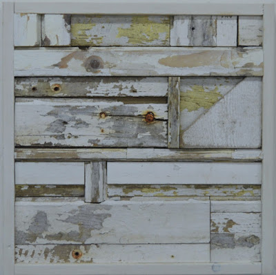
My new work continues to focus on  what gets left behind, but I have moved from two dimensional works to three dimensional using found wood and objects to explore Compositions in Time.  

wood assemblage, wood collage, found materials,
Composition in Time #22,  2016, Margaret Ryall , wood assemblage, 16 x 16 in. 

wood assemblage, white wood, remnants,
Composition in Time #27, 2016, Margaret Ryall, Wood assemblage, 16x16in.
white and blue wood assemblage, reclaimed wood
Composition in Time #29, 2016, Margaret Ryall,  wood assemblage, 16 x16in. 

For more work check out my website   

One or the other of my two careers  usually gets the short end of the stick;  I may have to do something about that.  Decision time is creeping up on me.

Yes, I know I never did write a post about my new kitchen.  That is coming this fall, but first I have two more weeks in beautiful Duntara.

The post Choosing what’s important appeared first on Decor Pur.