Showing posts with label work. Show all posts

Thursday, December 29, 2016

 Decorators get all kinds of requests for services from furniture layout to full home designs. I like the variety of smaller jobs with  the ones that go on forever.  Two of my favourite tasks are rehanging art to best advantage and providing the last layer of accessories in a home. Sometimes I get to do both in the same house!

Over the next several posts I want to provide a glimpse into the thought processes I use when accessorizing a client’s space.   Think about it as adding the icing to an already great cake. If you do it for your own home or as a professional service, the task is really the same. You have to juggle design principles with individual taste (both decorator& clients) and existing elements in the home.

 Sometimes homeowners have  objects  to incorporate in the design and other times you may  start with a clean slate.   As a decorator, I find  a  clean slate  more difficult  because I want to choose accessories that are “sensible” for the homeowner.  By that I mean  I want to select objects that relate to  family composition, budget, existing objects  and  interests.   Here’s a little of how it goes…..

Use what is important to you
Re-use objects from other rooms
Mix shapes and scale
accessories: Making it all work

 This is a perfect example of  how existing objects  can  form the backbone of a great vignette.  The crystal vase was a wedding gift and  the lamp was in another room, but the scale was too small for that space. The homeowners had the mirror from their previous home.  When I saw the silver cut edged design in the frame that  mimicked the cuts in the crystal, I knew it would work.  I have to admit I am a firm believer in giving  new life to “previously loved” things.

There is  variety  in the  shapes in this vignette.  The major objects (table and mirror) are rectangles,  the bottle, vase and lamp are cylinders, the ceramic bowl a softened square.   Spheres are introduced in the top of the bottle and the floral shapes.  The leaves serve to soften all the shapes with their lovely droop.

 Have a mix of warm and cool tones

The homeowner wanted something to put keys in so the soft white ceramic bowl with a  coppery/bronze interior was chosen.  If everything is silver why add  warm tones ?  I like to mix metals for interest.  The jar behind  the bowl is mercury glass and it has a bronzy metal top- both work with the warm tones in the orchids.   So three cool tones and three warm tones.   I always mix warm and cool. 

Choose an accent colour from other objects or art
Move the accent colour around the vignette and the  larger space 

 Pay attention to the geometry in a space

Move  colours around the vignette.  This is a must for success.  When you have a mirror and a small space you can depend on what is on the opposite wall to add to your vignette.   You can see glimpses of  the opposite side of the porch  in the mirror. 

Choosing an accent colour
All the walls on the main floor are a cool blue gray.  You already know I like to mix warms and cools in any scheme, so I wanted a warm colour to offset the cools.   The first thing I chose for this room was the art. The pillow was second. The art was chosen based on what I observed hung in the home on my first visit. Two of the pieces had orange as a primary colour and both had elements of  landscape in them.  This is a more interpretative landscape which is also usually  a safe purchase.  The lines of design in the painting  bring the viewer in an up thus adding depth and height to this small space. it works well with the scale of the bench and the the nine foot ceiling.

I couldn’t pass up the repetition of the back shape of the bench in the pillow.  It serves to break up the dark in this small space and moves your eye around.  I also love how the diamonds duplicate the linear quality of the trees but in a more complicated way.

 Choose items that can work in several formations


 If you choose your objects wisely you can move them around and add seasonal items to the decor when needed. And most importantly of all do not get over stressed when things mysteriously get bumped or shoved off centre as the table in the above shot!  People live there.   


And that is why homeowners call a decorator!

The post Accessories: Making it all work appeared first on Decor Pur.

Saturday, December 24, 2016

Art warms a home, makes it interesting, provides topics for conversation and contemplation , adds colour,  the list goes on indefinitely.  There are various ways to display art; some are more successful than others.  One option is leaning  art against a wall rather than hanging it, but this display option isn’t always successful for a variety of reasons.  If you want to try leaning art, consider the following factors.

1. Scale – Choose artwork large enough to read from standing or sitting  position


leaning art
Mark Dodge Design
 
 The size of a piece of art in comparison to the space and objects around it usually determines successful placement. This painting fits the bill perfectly.   
leaning black and white large scale art
 Large scale images work best

source

When you want to lean work on the
floor it needs to be large enough to observe from standing position and
bold in imagery so it can be read at a distance. Even the dog get this!

 The photo on the right works better than the  the art to the left of it because the image is tiny. 

large leaning abstract art dining room
 Mark English Architects, AIA

Perfect scale and beautiful work that can still be seen and read while sitting or from other areas of the room. 

simple black and white composition leaning art
Bold form and simple composition

source

The boldness and simplicity of this painting  make viewing it easier when leaned on the floor.  The objects in front of it enhance the placement and help to anchor it safely. They do not interfere with the reading of the image. Which leads to the next guideline…

2. Layering: Don’t cover major parts of an artwork

abstract leaning art with chair
Successful layering

source

Layering other objects in front of an artwork is a tricky business.  This vignette is successful because the image is large, dark and has quite a bit of space where there are no details.  The chair and table lie in areas without too much detail.  You don’t feel as if you are missing  important elements of the work. 

large leaning artwork behind table
Do you want to remove anything here?

source

There are so many things about this vignette I love, but I want to see all of the artwork and part is hidden by the table and books.  Even removing the books would help things considerably.   Love the candlesticks and the table, both really work with the artwork.
leaning art on mantle
Successful layering where each image is clearly seen.

source

 Layering art on shelves, consoles, and mantles can be very interesting. It is a way to display smaller pieces  to good advantage.  While this is a very simple vignette with the branch acting as a consolidating element, it is possible to have more complex collections of objects.

3. Colour scheme:  Restrict colour combinations in  leaning gallery display

 
gallery wall limited colour scheme
Limited colour scheme provides cohesion

 source

 
There are lots of small pieces in this display but they read as one unit because of the colour cohesiveness.


4. Image: Choose the right image for the space

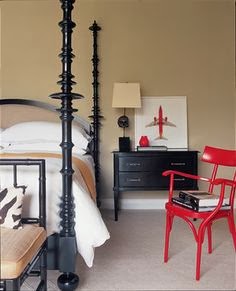
red airplane leaning art
Art with simple bold form

 source
I think the work that layers best in a vignette has bold form and colour.  It can compete with the other objects for your viewing attention.
Now it’s your turn.  What do you think of this arrangement?
 framed art leaning
source


The post Leaning art: 4 Guidelines to make it work appeared first on Decor Pur.

Friday, December 23, 2016

Ideas for using burlap in crafty, country decor have taken over my Pinterest feed lately.  My own decor is a mix of contemporary and mid-century modern with a generous application of contemporary art.  Burlap just doesn’t seem to fit with that mix.  But wait…  just tell me something doesn’t work, and I am on a journey to prove otherwise.

 Currently in my art practice I am questioning public expectations for certain materials.   Perhaps that’s why I am thinking about burlap.   All those country/homey pins for burlap  got me thinking about raising the ante, by taking burlap  out of its country comfort level.

So let’s explore the question.

I like burlap because it …

  • has texture;
  • is a natural fibre from the jute plant;
  • is a renewable product because of its source;
  • is  available in several  neutral colours and can be dyed; 
  • is relatively inexpensive;
  • can be used without sewing;
  • accepts paint well;
  • comes in a variety of widths and qualities;
  • has an open weave for introducing  different materials into design. 

On the other side are several drawbacks…

  • it is smelly; 
  • cheaper varieties are very coarse; 
  • it is usually stiff and doesn’t gather well; 
  • the weave is uneven
Here’s a collection of commercially produced products using burlap.  Obviously, this isn’t the burlap you wrap your trees with in fall!

There are also lots of options for DIYers or to purchase from sites like ETSY. 

Pillows 

source 
source 

Window Treatments 


source 
source 
source 
source 
 source 

Runner 

Bedskirt 

source 

Art 

source  

Now it’s your turn….

The post Does burlap work in contemporary decor? appeared first on Decor Pur.