Showing posts with label decor. Show all posts

Friday, December 30, 2016

I can’t believe that December whizzed by without much thought to home decor  blogging.  The holiday season always puts things on hold. I have to make up for that with a good summary of what 2016 holds in design trends for the home.

 How do I know what to write about trends? A good question for sure. Knowledge comes from a lot of reading and looking and being a good synthesizer.

  A trend is never  for one year;  all I have to do is look back at what I wrote last year to realize that everything still holds true.  When I write about trends I  like to write about broader patterns I notice in  home decor  that I feel have some staying power.

There’s nothing earth shattering to report for 2016, but there’s usually not major shifts.

Plants  and plant motifs bring the outside in  

 Home decor trend plants plant motifs
Source 
You can also see the use of blue, wire furniture, and natural woods carried over from last year. 

Pastels are still creeping in usually mixed with soft whites

Pantone’s 2016 colour of the year duo supports this.  I’m not saying I love this look but I do like the softness of the colours., there’s just too much baggage attached to pink and blue.  Take either separately and I am fine, especially that periwinkle blue.  
Pantone 2016 colour of the year
pastels bedroom nude pink mint green
Source 
 Here we see the nude pink with mint green (hello 1980’s) and blue accents.   Notice the plant!

Adding texture using organic materials 

 It could be fur, woven textiles from natural fibres,  wicker,  rushes, or plant life.  All add that exciting layer of texture that every room needs for interest and excitement.

texture organic materials
Censationalgirl 

Hope you noticed the liberal use of greenery in this space too, and the white walls and furniture. White is the perfect backdrop for showing off textures. 

texture 2016 fur natural fabrics
source 

Warm metals in  accessories, fixtures and lighting 

I know I’ve been saying this for three years, but each year the presence of warm metals becomes more noticeable.  Also consider burnished brass, copper and rose gold.  

warm metals lighting art work

source 
This is a totally trendy room,  nude pink undertones, lots of texture, warm metals, natural fibres, plant life and light walls. And the opposite is also trendy….

Dramatic walls and rooms

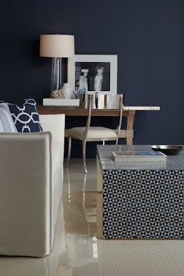
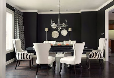
This is in direct opposition to the white/light look for walls and furniture.  But drama can be embraced.  It’s not for me at all, but it is a look that appeals to many people.  Navy walls are particularly fashionable as are black and rich greens.  
 navy walls dramatic rooms
dramatic rooms gold texture black walls
source 
black walls white dining room dramatic rooms
source
These are trends from 2013 -2015 that are still going strong:
  • geometric patterning 
  • nature inspired motifs especially florals 
  • reclaimed/eco-friendly material
  • wire framed furniture and lighting 
  • use of mixed materials in furniture  ( marble and wood, metal and wood etc. ) 
  • global inclusiveness  ( products from different cultures)
  • highly patterned tile
  • artisan products ( hand made) 
  • nude pink and deeper blues.  
And there you have it.  Lots of things to consider and choose from or just go on your merry way doing what makes you happy in decor.  

The post 2016 Home decor trend checklist appeared first on Decor Pur.

 Yes, I’ve been Pinteresting too much again. It’s one of the best ways to see what the common trends are in interior design.  I am not talking about the “cutting edge” ones touted as design trends for a particular year, but the ones that you know average people usein their homes.  These common elements are sometimes referred to as “decorating crutches” because anyone can use them in any space.   I bet you know them already because they are constantly flying by your eyes on Pinterest or Instagram or in home decor stores.

 Check out some of the hallmarks of decor predictability in 2016  compiled from an evening of online viewing. Here are a few pics for you.   Can you see any similarities in these spaces ?


Here’s what I came up with…
  • overly coordinated fabrics and accessories 
  • trays used to corral vignettes on tables
  • stacking books in vignettes 
  • pale rugs 
  • lots of  candles 
  • box store art
  • art that gives you directions (word art)
  • antlers and faux taxidermy 
  • empty frames ( is it a conceptual art statement or just a thing?)
  • dishes that match a room’s colour scheme
  • accessories covering every flat surface
  • cute holiday and seasonal vignettes
  • beachy colour schemes 
  • hurricane lanterns
  • girlie chandeliers 
  •  mirrors everywhere  
  • mason jars used for every conceivable purpose
  • fake topiary
  • changing  seasonal/holiday displays 
  • gallery walls with everything apart from real art 
  • large wall clocks 
  • bleached wicker 
  • overuse of baskets for storage
  • and abundance of pillows and throws
  • gray everything
  • pale wall colours
  • family references and a touches of sentiment

How predictable is your decor in 2016?

 Is it a bad thing to be predictable?

  Probably not.

 We like what we like, and likes are developed through exposure (repeated viewing). In today’s world of social media we do a lot of viewing.  Likes are also shaped by your social circles, your decorating budget, and what is  readily available in a local area.  Sometimes we want to be the same as our friends and we model each other.

We all have things we are attracted to and use in different ways in our homes. From the list of overly used elements above  I  am guilty of: stacking books as fillers and to vary heights,  using trays to corral objects in vignettes,  layering with  throws and using an antler in various arrangements (but it’s a real one found on a hike) and I do have a thing about pillows.  I am happiest in light rooms and gray has been my go to neutral since 1985.  How about you?

Stay tuned for 10 ways to interject a little decor rebellion in your space.

The post How predictable is your decor? appeared first on Decor Pur.

Tuesday, December 27, 2016

One of the major mistakes homeowners make in home decor is ignoring the power of pattern in creating an interesting space. Fabric is an excellent way to introduce pattern into your space and there are so many ways to use it. 

 I am a sucker for fabric patterns and textures and often buy  on spec when I find a good deal. If you are removing fabric from a room e.g., drapes, you may be able to upcycle them.  Don’t forget about the beautiful fabric finds at thrift stores.  Be creative.  These ideas should get you thinking.

 Make a throw

upcycled fabric throw
Look for large scale textured fabrics and sew on a fringe to create a throw for your sofa. 
 source 
 

Heavy fabrics work best for this application.  If you think it is heavy enough to upholster a dining chair it will be heavy enough to pull off this look .  If you don’t like fringes omit that element and just do a double top stitched seam.  FYI this image is a bought throw. 

 
Desinging Home: folded fabric in chair back
Upholstery fabric folded over a chair back – as simple as it gets

Margaret Ryall

 Frame fabric

 matted framed fabric art
Matted and framed fabric art

source

You have to look twice to realize these are pieces  of fabric.  They are so chic. The mat works wonders to show off the pattern and connect with the lovely blue wall.  I would have them a tad smaller to work with the narrow space.  That’s just me and my need for any art to have breathing room.

 stretched fabric art DIY
Fabric stretched over wooden frame

Margaret Ryall

This is one of my favourite quick art solutions.  Find a fabric that you love and works in your room.  It will need to be larger in scale to read at a distance.  Buy a stretcher frame in an art store or make one using pine.  Stretch the fabric over the frame and staple on the back of the stretcher. 


Cover a lampshade

 fabric covered lampshades DIY
 Choose fabric for lampshades wisely
 source

Many DIY projects  look homemade.  The trick is to elevate your project into high design by choosing your fabric wisely.  Ask yourself …Would I find this in a store?  If the answer is Yes -Go for it.  If  you think it will look like you made it — pass!  Aim for sophisticated design.

 Fold fabric over an upholstered headboard

 folded fabric over upholstered headboard DIY
source

What a way to add and frequently change colour in a monochromatic bedroom.  I just love the connection between the roses and the magenta  fabric.  Quick and classy. 

 Upholster a headboard

 upholstered headboard pillows DIY
Upholstered headboard and matching pillows 
 source

No doubt this is an upholstered headboard done right.  The pattern adds to the other plain fabrics in the room.  It connects with the pattern in the art.  Everything is perfect. Are you handy enough to create this look yourself?

The post 5 Creative uses for fabric in home decor appeared first on Decor Pur.

Monday, December 26, 2016

I am interested in following the latest  trends in interior design.   I need to know these things to have relevant discussions with clients and to understand where the industry is headed.  Many  trends come and go without ever hitting the average home.

Colour of the year is a good example of a temporary trend.  Depending on which paint company your like, you will have a different colour of the year!   I use Benjamin Moore paint and this year the colour of the year is ….


 Lemon Sorbet 2019-60

This is an interesting fact to know, but I doubt this time next year it will make much difference  because there will be a new colour of the year.

 Then there are broader colour trends that seem to last for much longer, e.g., the change from beige/brown to grays as the predominant neutral in home decor.  This type of information  is  more important to be aware of because it produces whole palette shifts in home accessories including textiles. The  change to grays has moved palettes from warmer and earthy  to cooler and cleaner colours.

 Rather than the burnt orange/rust  of the brown/beige  era
 source 
 you will now find  a more true orange mixed with grays.
 Rather than olive/mossy greens of the brown era…

  you will find fresh apple greens.
You can have such wonderful pops of colour with grays and this is
reflected in the vibrancy of home accessories available in the market
place today. 

 Several years ago I looked for emerald green accessories for a client.  It was almost impossible to find any!  Pantone’s colour of the year for 2013 is…

I find Pantone’s colour predictions have more impact on fashion and home decor than those of specific  paint companies. This year you will have no difficulty finding emerald green accessories.

 It is important to keep up with trends that will  impact big ticket, relatively permanent products like hardwood, tile and cabinets.  You do not want to select something that will be dated  quickly.  Awareness of these trends does not mean you have to buy into them.  Sometimes choosing exactly the opposite is the the best design solution for longevity.   That is why it is wiser to choose  more neutral  long term items for your home.

Homeowners  who jumped on the dark wood look  for kitchens will probably end up sorry for their selection sooner rather than later.     Extremes rarely work for long periods of time. I predict the patterned glass mosaic backsplash tile that is all the
rage now  will have run its course soon too.

 Reynolds Architecture- Northfield, Illinois

That’s why classic soft white kitchen cabinets will always work. There are no extremes in this kitchen.   The style is softly traditional, the tiles are plain and the counters are  lighter granite.   I know it isn’t everyone’s cup of tea.  I am talking about what stands the test of time.

 
Staying with a traditional example, if you don’t like white, consider a more mid tone neutral  or  …
  mid toned stained  wood. 
Stay tuned for 2013 decor trends with staying power. 

The post Are decor trends important? appeared first on Decor Pur.

Sunday, December 25, 2016

After a dreary northern winter I begin to long for a spot of green in my decor.   I’ve even given my blog a new green look.

 Last spring I wrote about my lucky bamboo,  my default plant that resulted from an aborted shamrock search.  Poles apart, I know!  Choice is often limited when you live on an island; you can convince yourself it’s what you wanted all along.

 I’ve been enjoying my bamboo and it seems to love my house.

 I went to look for one for a friend for Christmas.  None to be had, but I could find a shamrock.  Go figure.

What a difference a year makes. 

There’s nothing like a plant or a grouping of flowering branches to bring a space to life.  Even the most neutral colour schemes sing when there’s a little green around.


Pinterest  
Can you have too many plants?  Yes, in my opinion.  You don’t want a jungle. One or two plants  get noticed and more than that becomes a bit of a mess.  You may disagree.  

The post Adding greenery to contemporary decor appeared first on Decor Pur.

Saturday, December 24, 2016


 It seems like only yesterday I  wrote my  2013  home decor trends  post,  and I’ve already looked at Pantone’s Colour of the year, Radiant Orchid, and suggested  ways to integrate this vibrant colour into your decor. What else can we expect in the coming year?

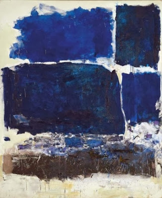
While Radiant Orchid is Pantone’s colour of the year, I think it will be the blues that will take over the stage in 2014.  Joan Mitchell had this all figured out in her 1972 painting!  She painted the best blues ever and these are the ones you’ll be seeing more of in 2014.

decor trend 2014 blues
Joan Mitchell, “Blue Territory,” 1972
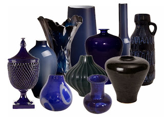
 And here’s a modern interpretation of the darker side of blue…


2014 blue trend home decor
A range of blues for 2014


This year the popular blues are much deeper leaning toward cobalt and navy.  But what can you put with so much blue? 

decor trend 2014 blue and yellow
Add yellow as an accent in 2014

decor trends 2014 navy and gold
Gold accents work well  with navy blue and cobalt

And don’t forget vibrant oranges or greens with dark blues.  The sky is the limit with this colour.  I thought the art work in the mood board above gives lots of accent choices. 

navy blue cobalt blue 2014 trend Designing Home
Versatile green blue looks great with white and radiant orchid

And never forget that blue has a green side that mixes with all sorts of colours especially the pinkish purples like Radiant Orchid. That way you can bet two trends for the price of one.  Think turquoise, aqua and any blue you may see on a Caribbean holiday.


Benjamin Moore highlighted the lighter side of blue for their 2014 Colour of the year. It is reminiscent of summer breezes blowing lightly under a pale sky. Cool and inviting and perfect for a summer house or a spa retreat.


It seems all versions of blue are hot this year. Is there blue in your future? 

The post Blue- A home decor trend to watch appeared first on Decor Pur.