Showing posts with label contemporary. Show all posts

Sunday, December 25, 2016

After a dreary northern winter I begin to long for a spot of green in my decor.   I’ve even given my blog a new green look.

 Last spring I wrote about my lucky bamboo,  my default plant that resulted from an aborted shamrock search.  Poles apart, I know!  Choice is often limited when you live on an island; you can convince yourself it’s what you wanted all along.

 I’ve been enjoying my bamboo and it seems to love my house.

 I went to look for one for a friend for Christmas.  None to be had, but I could find a shamrock.  Go figure.

What a difference a year makes. 

There’s nothing like a plant or a grouping of flowering branches to bring a space to life.  Even the most neutral colour schemes sing when there’s a little green around.


Pinterest  
Can you have too many plants?  Yes, in my opinion.  You don’t want a jungle. One or two plants  get noticed and more than that becomes a bit of a mess.  You may disagree.  

The post Adding greenery to contemporary decor appeared first on Decor Pur.

Friday, December 23, 2016

Ideas for using burlap in crafty, country decor have taken over my Pinterest feed lately.  My own decor is a mix of contemporary and mid-century modern with a generous application of contemporary art.  Burlap just doesn’t seem to fit with that mix.  But wait…  just tell me something doesn’t work, and I am on a journey to prove otherwise.

 Currently in my art practice I am questioning public expectations for certain materials.   Perhaps that’s why I am thinking about burlap.   All those country/homey pins for burlap  got me thinking about raising the ante, by taking burlap  out of its country comfort level.

So let’s explore the question.

I like burlap because it …

  • has texture;
  • is a natural fibre from the jute plant;
  • is a renewable product because of its source;
  • is  available in several  neutral colours and can be dyed; 
  • is relatively inexpensive;
  • can be used without sewing;
  • accepts paint well;
  • comes in a variety of widths and qualities;
  • has an open weave for introducing  different materials into design. 

On the other side are several drawbacks…

  • it is smelly; 
  • cheaper varieties are very coarse; 
  • it is usually stiff and doesn’t gather well; 
  • the weave is uneven
Here’s a collection of commercially produced products using burlap.  Obviously, this isn’t the burlap you wrap your trees with in fall!

There are also lots of options for DIYers or to purchase from sites like ETSY. 

Pillows 

source 
source 

Window Treatments 


source 
source 
source 
source 
 source 

Runner 

Bedskirt 

source 

Art 

source  

Now it’s your turn….

The post Does burlap work in contemporary decor? appeared first on Decor Pur.

Monday, December 19, 2016


I’m very excited about my new At Home series. I’ve done the thinking, the calling, the cajoling, the photographing and the writing.  All you have to do is  follow behind me as I knock on doors and poke around inside to see how homeowners create a welcoming home.

At Home guest:

Sharon Griffin, once a co-worker of mine,  a fantastic gardener and quilter extraordinaire, has graciously let me invade her space.  A year ago when I visited herquilting studio, I couldn’t help thinking  how quietly many of us work at hobbies and interests, and even friends don’t know the extent of our involvement. It’s only when you start asking questions that you find out what people are really up to. Yes, I asked lots of questions.

Beginnings 

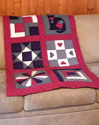
 Sharon began quilting in 1996 when she was attracted to a quilt her sister-in -law created.  She hasn’t looked back since that first course  when she created the quilt below the old fashioned way.  No rotary cutters then and little fabric selection in our fair city.

traditional quilt decorating with quilts
First quilt 1996

While many of her first projects  employed traditional patterns and techniques, participation in two local  quilters’ guilds, travel, and the internet broadened her exposure to a  wide array of  quilting techniques and styles. As you walk through Sharon’s home and visit her quilting studio, you  realize that her interests are changing and her pieces take on a more contemporary feel.

traditional quilts decorating with quilts
Traditional patterns on quilt stand

 Why quilting?

No one could dispute that quilting creates beautiful objects, but I suspect there is more to Sharon’s interest in it than that.  She  admits to being an organized, tidy person and there is something about the precision needed to quilt that suits these characteristics. It is a quiet, solitary activity that also can be quite social, and fulfill a love of learning if you participate in guilds and workshops. I’ve always know Sharon to be a lover of fabric and colour.  What better interest could she choose than  quilting?  Her work adds uniqueness and warmth to her home.  This is so important in  a world of mass produced objects.

Variety of Applications

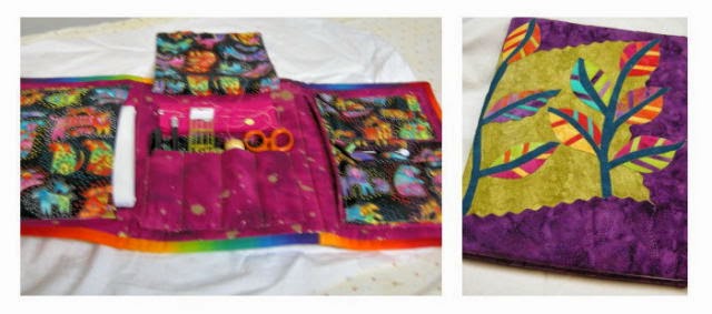
And quilting isn’t just about quilts.  The range of projects is limitless…

quilting projects decorating with quilts
 needle holders, glasses case, bags, mug sleeves….

quilting projects decorating with quilts
sewing kits, journal covers…
quilting projects decorating with quilts
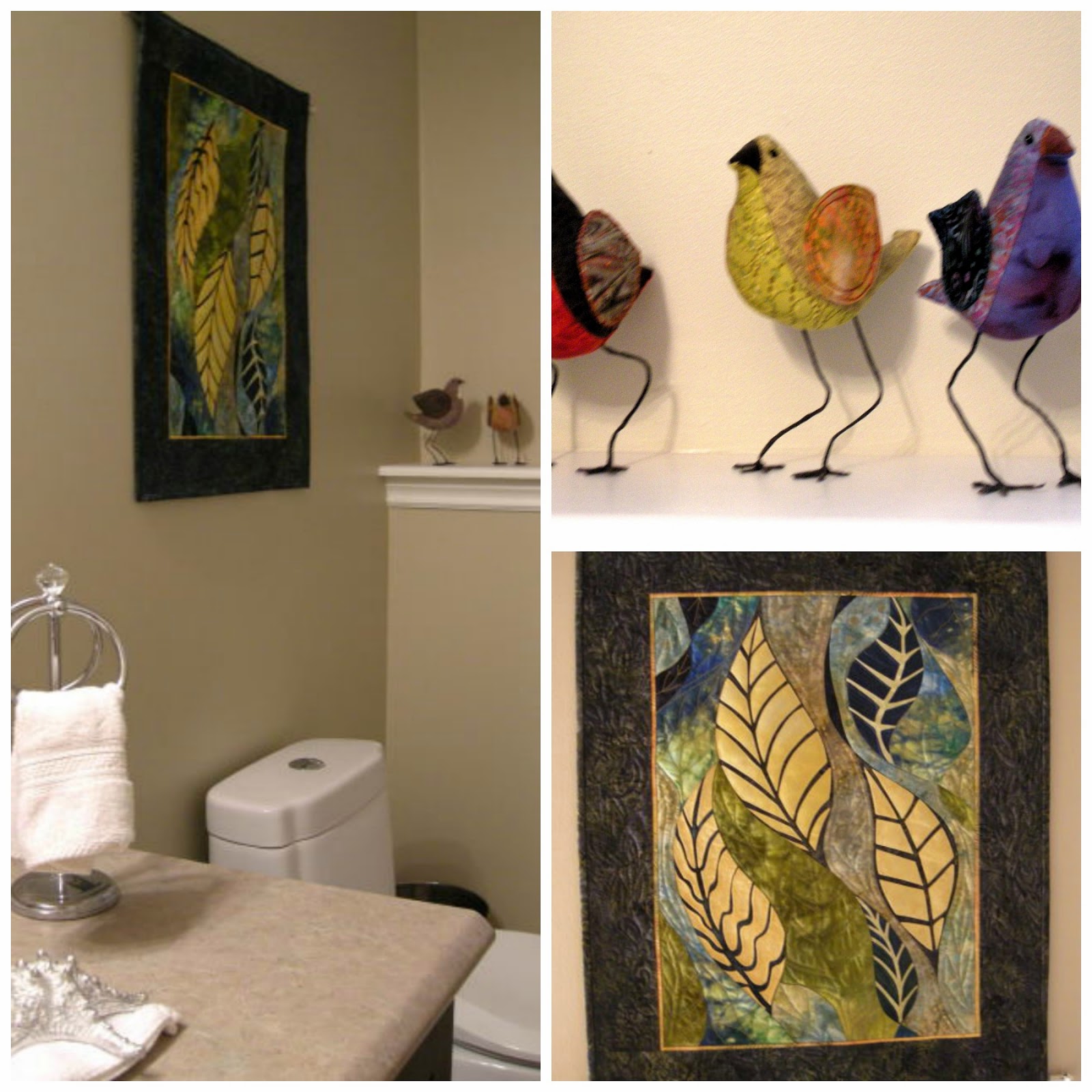
3 D birds, wall hangings  and …
he wall quilt blocks decorating with quilting
 Off the wall blocks.

Being a lover of all things contemporary, these off the wall quilt blocks really impressed me.  I would have no difficulty adding  one to my own contemporary decor.   Because they are finished on all sides and stand up well, they could be added to any mantle, shelf or  table top as part of a vignette. This has gotten me thinking…
quilting projects quilted wallhangings
Cultural influences

In these wall hangings you can see the influence of various workshop leaders from different countries and more and more opportunities to create personal work by taking the techniques taught in workshops and making them her own.

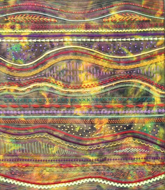
It’s easy to see that landscape has become a primary influence in  Sharon’s more recent work.

quilting projects quilted landscapes
Abstracted landscape created with a variety of threads
quilted projects quilted landscapes
NL landscape with lots of stitching

quilted projects quilted landscapes

And this  truly amazing one is  pieced together and embellished  to such
a degree that one would think it was a painting.   A photo of their
garden shed was the inspiration.   

Integrating quilting projects in your decor

 When you are a prolific quilter there is no way you can display everything you create.  Family members usually make out well  for birthdays and Christmas!  More  things get stored and brought out for seasonal events.  The trick is to show just enough, and to come up with ways to showcase  projects that put them front and centre.


Let’s take a tour

quilted projects living room dining room decorating with quilts
Dining room and living room quilted projects

 A strong preference for warm, rich  colours adds so much to the soft white
furniture in the living room.  While there’s quite a few quilted accessories in the living room and dining room, the space doesn’t feel overdone. One of the reasons is the variety of projects used : a quilt, a wall hanging and a pillow. If you look at all four images you can see how the different colours flow throughout the space creating cohesiveness, warmth, and  an open
invitation to sit awhile. 

  The poppy wall hanging in the dining
room is new and very striking. When I first saw it I thought it was a painting it  is so realistic.   I’m glad it is hung at the perfect height for guests to observe it when sitting down.

A photograph  does not
do justice to the overall stitching and embellishments at the centre of the
poppy. Do  have a closer look.

quilting projects decorating with quilts
Master bedroom  in chartreuse and pinks

Rather than a quilt, a  bed runner is used to accent the bed and the wall hanging on the opposite wall  is the first thing that greets you as you enter the bedroom.  
Don’t you love the freshness of this colour combination?

quilting projects decorating with quilts
Autumn inspired guest room

One of the best ways to integrate quilting into decor is to choose lighter backgrounds  that won’t compete with the patterns in the quilting. Sharon’s favourite  background is a soft white. As you can see it  is perfect for showing off any colour combinations, and it has a very contemporary feel even when the quilting pattern is traditional.   The connection between the quilt and wall hanging in this room  creates a fresh, welcoming look and the colours  blend beautifully with the honey toned furniture. 

quilting projects decorating with quilts
Black and white is always striking

Nothing looks sharper than black, especially with white.  The reversibility of quilted projects  allows you to have two looks for the price of one.   You can also use a table runner as  a bed runner  to accent  a twin bed. Pillows can be moved from room to room if you keep the colourways neutral enough.

And there you have just a glimpse into the world and home of this prolific quilter. Thanks Sharon for letting us visit her home.
  Thanks for dropping by.

The post At Home: A contemporary quilter appeared first on Decor Pur.

Accepting a visitor/decorator into your home to deconstruct it in words and pictures is not for the faint of heart.  There’s  an element of trust in this endeavour, trust that I will represent the home in a truthful and pleasing way. Knowing this, I am always so pleased when homeowners accept my proposal to highlight their home and discuss elements of their decor that I am interested in writing about.  Once again I have willing participants in my At Home series.  


Come along to see what the Erls have been up to for the last six months since they moved into their new home in the east end of St. John’s, NL.

WELCOME
The entrance to this home provides a pleasing welcome with it’s bold colour scheme and inviting landscaping.  As you move inside you soon realize that the exterior is an extension of the overall feel and colour schemes utilized inside. 


A neutral background


It is very obvious that Gail and Gary are  detail oriented people because  great attention is given to  both the  permanent fixtures  in their home as well as the smaller details. This is a warm home even though the majority of rooms are painted  Benjamin Moore CC40 cloud white, a tried and true warmish white.   Thankfully I don’t have to try to put a positive spin on a cool white (e.g.,  Benjamin Moore decorator’s white) which I am not in the least attracted to.  Thanks for making my job easier!


High contrast

high contrast black doors, black stairs, dark wood finishes
One of the most striking aspects of this home is the high contrast between the  darker wood finishes
( hardwood, doors, stairways), and the light tile, walls and windows.  The stained glass transoms created by Don Ryall were designed to parallel the one in the entry.  Two additional transoms over the entries to the kitchen carry this patterning and contrast into the centre of the house.


Vibrant accent colours

Gail has broken up the neutral framework with her love of vibrant colours liberally employed in her accents.  With each room having a different accent colour ranging from blues to orange and red you are kept interested as you move from room to room.  There is definitely an up beat feel to the space.   Knowing that Gail is a gardener, I would describe her accent colours as a garden palette.


Function and form

When you choose basic colours you can move things around to see where they look best. Gail’s accessories for the most part are functional objects: pillows, clocks, baskets, vases, candles, trays, throws etc., which are easily interchanged.  While I was photographing, I had the urge to do just that to show the versatility in her collection of objects, but that might be another post. 


Use what you have

One of the struggles many people have in a move to a different style and size of home is carry over.  Often what looked great in one space, just doesn’t work in another even when you keep much of the same furniture.  When I questioned Gail about this she estimated she reused about 80% of her things.  She believes  her interest in certain colours remains constant, and much of what she purchases can be used in a variety of settings.   Pillows are quickly updated with new covers, while vases, a particular favourite, alway work in a space for flowers/greenery, or to add a sculptural element to the simplest arrangement of objects.    Re-using accessories is a responsible approach to decorating, and it also provides the much needed time to find the final finishing touches.


Wood tones as a backdrop


Since the vibrancy of her accent colours are reminiscent of a riot of colourful flowers,  a range of wood tones in furniture and accessories  provide  a great foil this the bold intrusion of colour. Mixing wood tones throughout a space creates warmth and carries hints of nature throughout  a home.  While some people get carried away with efforts to perfectly match wood tones,  a more eclectic approach provides greater interest.  Choose one to dominate and be flexible with the rest.  For more on  how to integrate wood tones like a pro check out this post.


Inspiration


When asked about sources of inspiration, Gail admitted she has a  weakness for decorating magazines, and also watches  certain decorating shows.  But there is no doubt in my mind that she takes much of her inspiration from nature because it is referenced repeatedly in her home.

A good example of this is the art work over the bed in the master bedroom.  Not only does it bring us into a relaxing day by the sea it also relates to the lake that is visible through the windows.  As you can see, window treatments are minimal and frame the great views.  


European travels  have obviously had an impact on how The Erls’ choose to organize and furnish their home from the single European duvets to the  clean lined aesthetic evident in every room.


The soft cream accents from the bedroom are darkened to a soft gold in the ensuite. Again, you can see nature references in the grain of the storage boxes and the content of artwork.


Seasonal decorating

If you choose the right accessories there isn’t much you need to do when special events roll around. Gail and I  have the same decorating philosophy about seasonal decor!  The answer to all her seasonal decorating is colour specific to the season supported by what else – flowers and greenery.  Pop in a few orange flowers in the tray you saw in an earlier pic  and you’re ready to go. That’s where her vase collection comes in. She  also liberally uses fruit and vegetables in her arrangements.


Vignettes

Chuckle, chuckle… decorating speak for arranged objects.  It’s the perfect word in my book, but I’ve gotten some strange looks from clients when I use it.   There is definitely an art to arranging objects in a pleasing way.  In essence, you are creating a 3 dimensional composition.  Check out this post for lots of tips on the various lines of design you can use when composing  arrangements.  In addition, the top three things to remember are: 1) odd numbers of objects; 2) varying heights; and 3) variety in colour and texture. Then there’s: repetition, balance (symmetrical and asymmetrical) and overlapping. I see all of these elements/ principles used in Gail’s arrangements.

For many people decor decisions are usually made at the  instinctual level.  Each of us is attracted to various colours, shapes/forms, textures, etc., and how  they can be organized.  Often we may not be aware of our biases.  I told Gail I would seek hers out for the post.  As you can see in the collage of kitchen shots above, she has a definite attraction to vibrant colours, repetition of form and threes.

Notice the repetition of rectangles above in the art, tray and the counter, as well as a strong vertical orientation in the vase and flowers. The curves in the apples, vase and flowers help to  counteract the straight lines.

Of course, you have to completely ignore the electrical collage behind the interesting one! Wouldn’t we love a house where all the functional elements could disappear into the walls?


A fresh apple green is repeated throughout her powder room.  Here there are threes again and a strong vertical orientation in the daisy art work.  I’ve made my own vignette/collage and added the bottle and branches from her stairs. It really does work better on the stairs, but you get the idea about moving objects from room to room when you have accent colours that work well together.  See the hint of orange in the tissue box and the the centre of the flower…. ah, the possibilities with this green and that dark wood.


Sightlines


Sightlines are often forgotten elements in home decor.  Looking through into another room or down a hallway and having an anchoring element/focal point to tease your eye is a way of providing interest.


When you enter the foyer in the Erls’ home and open the door to the living area you are greeted by this eye catching photograph of  their daughter, Karen taken by J. Reid Studios.  Not only does it provide a focal point from the entry, it continues to have a strong visual pull in the living room and dining room. 


Arranging things below such a striking piece  takes restraint because the portrait  has to shine.  You can see that the majority of  objects are darker, simple forms of varying heights.  Adding colourful things to this vignette would not have worked  half as well. The plant provides softness and connects well with the other plants/flowers in the room.   Also notice how the objects form a zig zag effect as they are arranged across the long expanse of table top – one of the best strategies for console tables. Balance is created without symmetry.

red Ikea media cabinet, Asian influences, kimono, vignette

When you walk out of the guest bedroom or up the main stairway this vignette greets you.
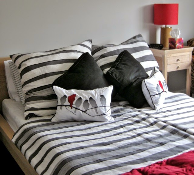
european duvets, striped bedding, red accent bedroom, accessories

The red is carried forward into the guest room and ….

...the orange from the kimono is used as an accent in the main bath.


There’s so much more I didn’t write about, but I’ve generously sampled the finishing touches in this home.  Thanks so much to the Erls for graciously agreeing to have us tour their home.


 Perhaps you have a favourite element or room or you  would like to share your ideas in the comments.

The post At Home: Finishing touches for a contemporary home appeared first on Decor Pur.