Showing posts with label Solutions. Show all posts

Thursday, December 22, 2016

In January during a blackout our pipes broke resulting in water damage to a number of rooms in our home. What was a bit of a disaster turned into a positive for me because it finally got me moving to do something about  one of my biggest decorating problems.  That would be my dining room…. See my complaints in this  post .  It’s quite a list. 


Too much of a good thing

This is how it all looked  in early 2000 …..

problems furniture arrangement dining room
Wood, wood and more wood


Problem lines  

Wood everywhere isn’t the only problem.  Note the all the horizontal lines from the buffets to the railing,  a light hung too high and a window that has a view of the window next door.   Below is my first attempt to solve some of the highlighted problems.

arranging dining room furniture
 A different orientation solves some problems

Rearrange and add


I liked the changes and that satisfied me for a short time.  The new light was a good height and the roundness worked well against all the rectangles.  I also added longer (very temporary and too short) drapes to break some of the horizontal lines.    I moved the art work from  the living room to dining room,  and created some height and brightness on the dining table.  Still seriously problematic in my book because I did nothing to alleviate the wood issue, but it was improved but sorely lacking  pizazz.

Enter 2014… 

The power of paint and fabric

One of the cheapest updates you can make to any space is to paint something.  I don’t care if it is furniture, accessories or walls, it works every time. Since we had to repaint all the walls (BM Glacier white) I continued on to paint quite a few things which I will reveal over the next several posts.  


painting upholstery dining chairs gray circles
 Bringing  it into 2014


To break up the wood and the set,  I was determined to sell all the dining chairs and buy new ones. I still don’t know how I got hubby to agree to selling 8 hand made solid ash chairs because they were too matched. He was probably fed up listening to complaints!

After an extensive search,  I realized the chairs that looked best with the table  were the ones my husband made for it. I don’t like sets, but in this case I had to concede.  So … after much discussion with sister and daughter and varying opinions, I found a fabric I loved and then choose spray paint to work with it. 

I would like to say that cleaning and spray painting 8 chairs was exciting.  Not so…. But I got to use my favourite motif (circles) and my favourite colour gray. What could be better!   Part 2 coming soon… new problems and solutions. Hint:  Look at the vignettes on the buffet and table.

What do you think?  


The post Dining room solutions appeared first on Decor Pur.

Sunday, December 18, 2016

Work is keeping me quite busy over the last several weeks and blogging always drops off when this happens.  I’m beginning a series of posts called Design Solutions that will  address common design issues that often crop up when I work with clients.This is a great way for me to come to  terms with options and at the same time it provides a written commentary that I can send clients to in the future.  If I can help my readers in any way, it’s a bonus.

Being a lover of asymmetrical balance, I can’t explain why I am so attracted to the placement of a bed between two windows.  But I am. The windows become part of a larger design tableau in such instances, and the whole wall must be considered as a unit including headboard, night tables, lamps, table vignettes, art, window treatments and bedding.   Here are several guiding principles to keep in mind.

 Keep it symmetrical


When you start with a layout that is symmetrical, it works best to continue using this form of balance in your design .

Consider  your headboard shape when choosing art

  No headboard

 The height  and shape of your headboard will dictate what you place over it .  When you have no headboard you have to choose something that will fill the space well, and circular shapes with lots of texture and warmth are brilliant.

High headboard
The pillows act as  the center of interest in this layout of high headboard framed by draperies.  No art is needed.

Many designers are attracted to  groupings of three objects (art) between two windows.  This is an option, but not one I usually advocate.  When there are too many rectangles my eye craves  something curved or solid. In this room  the art reaches the top of the windows filling the space in between thus making the windows, headboard, and art one large rectangle. 

Low headboard
Design Solutions: A bed between two windows

This is a beautifully designed space, both elegant and simple at the same time.   The headboard  is low and the six art works fill the space nicely.  It is always interesting how you can depend on one element or principle  of design to  negate problems with another one.  With all the lines in the windows you might expect  that 6 pieces of artwork would be overkill in this space.  Not so here.  The dark frames and lines in the romans make the window lines almost unnoticeable. Contrast always wins when vying  for attention.  The curves in the spectacular roman shades also provide some relief from all the rectangles.  I rarely hang roman shades from the ceiling, but in this case it works especially well.

Curved headboard

It is difficult to hang art over a curved headboard; it is often best to let the curves be the statement.  In this room a spectacular light fixture adds additional visual interest to the larger vignette.

And the exception to the rule… there’s always one!  The lamps fill in the curves and the three pieces of art look especially good hung in a straight line.  It doesn’t hurt that there is a circle in the headboard. The art is light and the bed becomes the center of interest in the room.

 Follow the lines of your curved headboard to place three pieces of art….


or use a round mirror or sculpture at the top of the curve.

Use window treatments to frame the bed

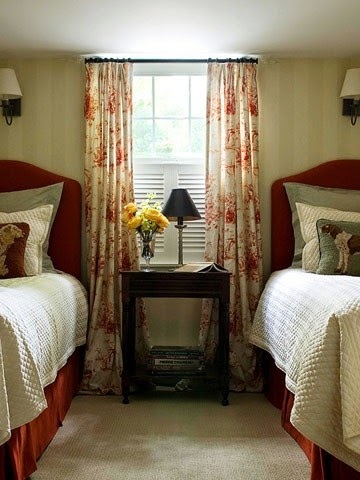
My preferred solution for a window treatment on matched windows is draperies.  They soften all the hard edges and make great frames for the bed and the night tables. Think about your table colour when choosing your drapes.  The tables should stand out not disappear. Yes, I would change the black, wrought iron rods! Love the simple pillow arrangement and circular mirror.


Consider using blinds behind draperies for privacy. and be adventurous when mixing designs  in the space. I think this combination works well because all the  patterns have the same colours.

Hanging a drape on the outside edge of both windows and using a shade of some sort is another option for a window treatment .  This solution opens up a small room and gives the bed more room to breathe.    The shades are the centre of interest in this room because they are so dark. Patterned fabric adds another element of interest.   I love  round night tables when there are two windows because they serve to soften all the straight lines.

If you want to maximize visual space keep your shades and drapes light and matching. Be careful when you choose rods for your window treatment.  Rods are
functional and to my mind they should blend into the decor not make a
statement that draws your eye upward. There’s nothing else black in this
whole room so why choose black rods? Check out a previous post on Choosing Rods.

Romans are simple and linear.  You would never call them soft, but they can frame a bed nicely when they are used in conjunction with tufted or other luxurious materials in a bedroom.  By choosing a simple monochromatic scheme these romans serve to move your eye around the room and allow the white window details to frame the bed.  The white art is a repetition of the the frames. 

 And why not make your window treatment the focal point in the room? Overload on draperies.

My parting comments:  This small  monochromatic space maximizes design in every way. If you want to put three art pieces above the bed it works best when there are soft draperies on either side.  The simple images and large white borders connect with the white bedding and lamps.  The larger white accessories are simple and perfect.   The dark furniture anchors the space and I don’t even mind the black rods!

Links to all images can be found on my Pinterest board Bedrooms.

The post Design Solutions: A bed between two windows appeared first on Decor Pur.

Tuesday, December 13, 2016

Mantles can bring out your inner decorator or cause you frustration.  I hope at the end of this post your inner decorator will be leaping.  If you don’t have a mantle, but have a buffet, console table or even a wide window ledge all the principles/design tips  still apply.  for additional information about  decorating above a fireplace check here.

Come along to a traditional home that is getting a foyer facelift.

Fireplaces and mantles are usually a focal point in a space.  Often there are other architectural details that ensure it is a dominant feature.  In this case, there are two archways on either side of  the fireplace, one into  the living room and the other into the dining room.  While the fixtures in the home are traditional, the homeowners have mixed in contemporary furniture while still honouring the original feel of the house.

Original photo from homeowner

Initial observations:

The mirror:

  • reflects the chandelier adding interest 
  • has simple traditional styling  that relates well to the  the other architectural features
  • will  reflect what is put in front of it adding  visual depth
  • frame has same tones as floor only darker
  • fits the width of mantle, but seems to overpower it (less so when you are in the space)
  • is heavy and mounted on original plaster walls, it stays 

Thanks to the program Olioboard, I can import the original photo from the homeowner and layer options on top of it. That’s designer’s dream when presenting ideas to a client.

With the central position of  the fireplace between two archways, a symmetrical design would  be a fitting line of design. l


Solution One:


 Emphasize a vertical layout using art to bring the eye up.

Including art work with a white matt  connects with the mantle colour (try to match the white matt with mantle, yes, this one is a tad too bright). You can play with the style of art work.  Sometimes adding a modern piece is a way to combine styles. 
traditional mantle, mantle vignette, art, decorating a mantle

traditional mantle, mantle vignette, art, decorating a mantle

traditional mantle, mantle vignette, art, decorating a mantle
Thoughts:

I like the simple calla better  because  the lines are vertical and the simplicity of composition and colour scheme is calming and works better with whatever objects you choose to put beside it.  I like rounded shapes next to verticals or if not rounded, something with soft, irregular  edges.  My choice would be the vases  rather than the topiaries because I like a lighter, softer look.

traditional mantle, mantle vignette, art, decorating a mantle
Here’s the same idea with a more traditional painting without any white.  The look is dark and a little overpowering and with no overlapping it looks a tad to boring.  All of this can be adjusted of course.  Which  painting works best? 
Solution Two 

Bring your eye in from the sides of the mirror by creating two strong verticals. 
traditional mantle, mantle vignette, flowers, decorating a mantle, sculpture

This is the opposite of the first solution but you are still using verticals to direct the  eye up. Having the flowers in a dark/clear frame connects with the darks in the fireplace, and also with the white in the mantle.  The vases are contemporary as is the sculptural piece but they all “play nicely together”.

Solution Three 

Go neutral contemporary and layer symmetrically.

traditional mantle, mantle vignette, decorating a mantle, vases,

This arrangement still brings your eye in from the sides of the mirror and emphasizes the vertical, but it is an overall softer look.

Solution 4

Pick up the  colours in the fireplace and layer symmetrically with a mix of traditional and contemporary.
Solution 5

Use battery operated console lamps and soften  the arrangement in the centre.
traditional mantle, mantle vignette,  decorating a mantle, asymmetrical design

Just for fun…

the girls in the house would pick this one!

and I am  more comfortable with asymmetrical designs.

There are so many options  and each has its own reasoning.  In the end it all boils down to personal taste. Which would you choose if you were the homeowner? 

The post 5 decorating solutions for one traditional mantle appeared first on Decor Pur.

Monday, December 12, 2016

 While a simple window treatment might solve your  basement window woes,  there’s a whole lot more you can accomplish with a little creative thinking.  Why accept mediocre when you can have spectacular!


If you think of your window as one aspect of a vignette, you can create stunning spaces where the window becomes part of a larger design.  This is a bit of a different way to consider tiny windows, but it leads to interesting ideas and solutions.

Create a centred layout between windows


basement window treatments centered fireplace
Centered fireplace and seating

Christian Gladu Design

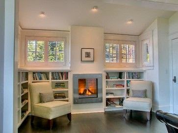
If you are lucky enough  to build a space give careful consideration to the placement of windows in basement spaces.  Depending on how your land slopes you can have sections where larger windows are possible.  Centering main structural elements between windows creates interesting designs.
basement window solutions window treatments
Small windows, big impact
Bruce Johnson & Associates
basement window solutions window treatments
Centre large peices of furniture under windows
Jennifer Hernandez


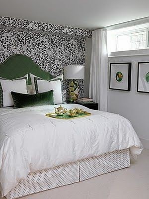
 A centered bed below a small window can do wonders to fill in the awkward space below.  Hanging drapes that also frame the bed adds an additional layer of interest to the vignette.


Disguise the size


If centering your layout around a window isn’t an option there are other ways to make those cramped windows look more important.  Your next bet is to  “fake it”.
basement window solutions window treatments shutters
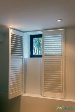
Using a custom shutter to fill the space 
 Houzz
 

 This is a solution I  love. A simple treatment with no additional details apart from the shutters. But layering with draperies as you can see below brings the whole space up a notch.

basement window solutions window treatments shutters
Is that a shutter I see? 
Better Homes and Gardens

This shutter is added to the wall below the window to create a longer, more interesting area  for the draperies to hug.  Adding the table below this faux treatment finishes the look. You could also get the same effect with top down cellulars with  an outside mount or even a woven blind attached permanently below the window.

basement window solutions window treatments shutters drapes
Go large or go home

Houzz

Shutters  can be used very effectively to give the impression of a large window. The drapes add a second layer of detailing and softness.

 Fake it totally


No window at all?  Don’t let that stop you from having a spectacular space. 

basement window solutions
This is one wow basement
Candice Olsen

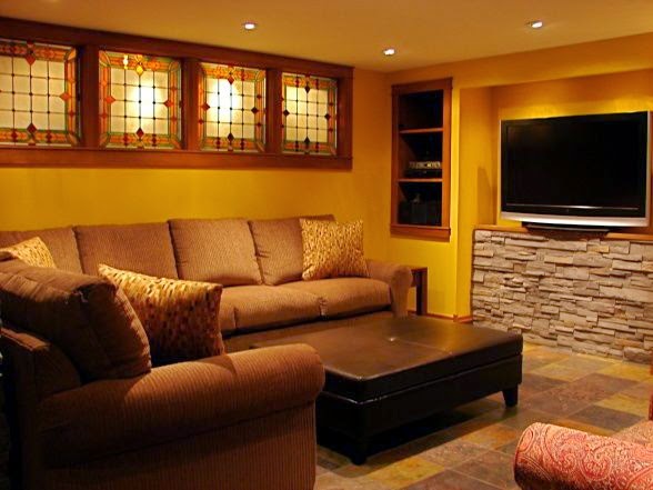
basement window solutions backlit stained glass
Backlit  stained glass
 Bayview Donovan


Work with contrast

basement window solutions contrast
Window frame painted black
 Houzz

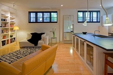
Sometimes you can use high contrast to actually make a small window
work in a space.  It seems contrary to common sense, but it does work if
you choose the right setting. If there was only one window in this room and it was smaller it would not look as spectacular. Of course, when using black it is important to have other black elements in the space to move your eye around. 
basement window solutions contrasting drapes
Dark drapes repeat the brown accent wall
Habitat Design


 I think this space could be
further enhanced by having something  under each window.  I am not a
lover of the dark lines and the blank wall showing between them. Check
out the next section for ideas to further enhance this contrasted look.

Fill in empty space


Because basement windows are so high up on a wall, you have to deal with all that empty wall space below them. Am I the only one who is annoyed by this?  If it bothers you too, there are several ways to solve this problem.  

1. Use art to trick the eye

basement window solutions  using art
Art used to extend and replicate
Things That Inspire

How much do I love this space?  Lots. It is fresh, well conceived with extra sleeping and the art work added below the windows visually enlarges each window by convincing your eye to read both as one unit.

basement window solutions displaying art
Display art to break up empty wall space
Asapela Home Design

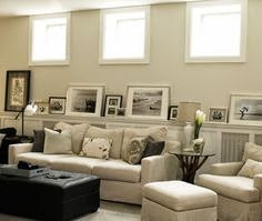
Many basements have a half wall  created when the concrete meets the wood framing. This space  provides the perfect  spot for art display but you  just need to know how to use them effectively.  This might be a good time to say never highlight  this type of wall by painting it a different colour from the top portion because it chops the room in half and is not interesting!

art filling space below basement windows
Larger art fills this space beautifully
TEA2 Architects

The power of standard repetition… same size, same colour and layered over repeated shapes.  The repetition really works.

art filling space below basement windows
Beautiful drapes and art work together
 Pinterest

 I think this is a stunning space because of how the windows were treated. Isn’t it well balanced and interesting?

art filling space below basement windows
Think about  image shape when choosing art
Sarah Richardson

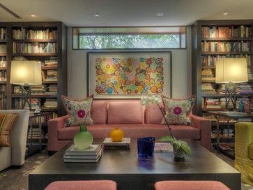
Doesn’t a circular motif soften the look of this artwork?  The dark frames relate to the accent wall pattern.

art filling space basement window solutions
Large art  can be a great filler 
 Ziger/Snead Architects

I admit it, I am fussy. While I like this look,  I want  the art to be a tad smaller and less busy with all the books.  An art work needs breathing space and low visual competition from what is surrounding it. 

2. Use furniture and accessories 

small basement window solutions

The Decorologist


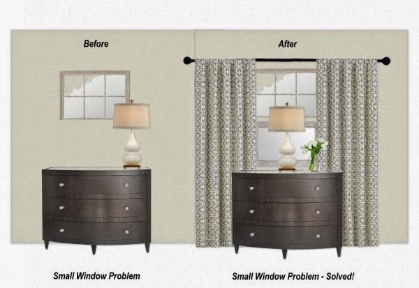
This is an interesting solution for a small window.  A second framed mirror was added below the window to fool the eye into thinking the window is much larger.  Then a chest of drawers and a lamp  was added to complete the look.

small basement window solutions
Working with bright accessories
 Ginger Freckle


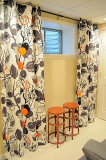
I love the stools and the drapery fabric.  This is an excellent example of where a piece of art with vibrant oranges would work below the window or  I might add a more substantial piece of furniture. A fantastic start.  

basement bedroom window solutions
Using every trick mentioned

Klang &Associates

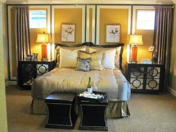
The two windows are dressed with drapes, the bed is centered, artwork has been added as well as furniture and lamps, and we have a new solution too – paneling which mimics the framing on the night tables.

 3. Use paneling

basement window solutions  paneling
Basement paneling should reach the windows
Remodelaholic

basement window solutions paneling
Window framing is part of paneling design
Houzz

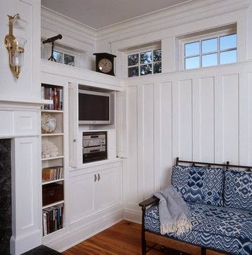
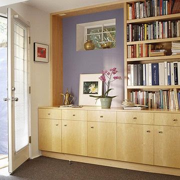
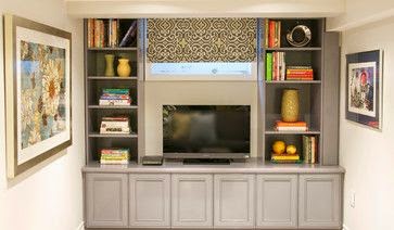
4. Add built ins to integrate small windows

basement window solutions bookcases
Using window size to determine shelving size
Charlie & Co. Design

Keeping all elements the same size adds consistency to the wall and helps to blend the windows into the construction.

basement window built itn solutions
Built-ins, art and accent colour together
Better Homes and Gardens
basement window solutions built ins
Built-ins and TV below window works well
Urban Ideas Inc.

And there you have it.  A collection of ideas from around the web that will ensure you don’t have boring, small windows in your basement. Do you have a favourite from the ideas presented? 

The post Basement window solutions that wow appeared first on Decor Pur.