Saturday, December 31, 2016

I don’t know about you, but around this time of year my decor starts to look a little like I feel after a long, cold winter.  Tired and worse for wear.  I had the urge to bring some spring to my house; I tried, I really did, but mother nature had other ideas.

  I had visions  of something  like this  for my front containers with a bit of fake thrown in until the real thing is possible – that means late June here.

Source 

 I bought pussy willows and some  short, purple flowers to  add to the greenery that is there.  Unfortunately the current items from Christmas are still frozen solid.   I have  what survived the raging winds and snow of winter ….

I guess it will be red dogwood, Spanish Broom and pine for a little longer! The berries are long gone.

Then I thought what about a new wreath to hang over the containers.  I wracked my brains.  Do you know a spring motif that would look great with Christmas planters?  I  couldn’t come up with one thing apart from twigs.  That wouldn’t help my craving for colour.

 My only recourse was to take in my Christmas wreath in an effort to remove a little more evidence that I am not with it.

cc960 french violet Benjamin Moore

 Then I tried to convince myself that my Benjamin Moore cc960 french violet door was my spring statement!  Feeble. But hold on a moment.

Would this convince you?  “… evoking thoughts of strolling along the Seine with an armful of violet bouquets”  according to the Benjamin Moore site.  That’s close, I chose it because of my memories of the lavender fields in France. My granddaughters have noticed that I love purple, at times it is a little too obvious!

 As in my latest pillow thanks to a scrap of lavender velvet left from 

this little beauty my sister made for a bench in my front porch.  Don’t you just love the decorative tucks that make a pattern?  My sister is a class act when it comes to sewing and decorating.  When I got rid of the nasty red accent pillows  I thought I wanted last spring, I knew my accent would return to purple and I would have to elevate this pillow to sofa status. Bye, bye porch bench.

 If you look up you can see where the idea for purple came from.  So spring has hit my house in the form of pillows.  I admit that isn’t too overwhelming.

Where does that leave me?

Still thinking about the  dining room table.  Still thinking….. Hum….

The post Is it spring yet? appeared first on Decor Pur.

  There are so many decisions to make when you begin decorating a new home or renovating. Something as basic as what colour to paint the trim often causes homeowners hours of deliberation.  How about you?  What decision have you made about painting your trim work?

1.  White/off white

This is  the most common solution to painting trim .  It works with every style and is fresh and crisp. 

 Norwich Architect Smith & Vansant Architects PC

Nightingale Design

Even if you have white walls your trim can also be white. Consider changing the paint sheen to semi gloss or gloss if you want to accentuate the trim in a white room.        

2. Wood – natural  or stained 

There was a period of time when many homes had natural or stained wood trim, but this trend has slipped a little in the last ten years.  When you have wood your decision is often to leave it natural or stain it.  When your floors are also wood, it can help you decide which stain option to go with.

 Contrary to popular belief wood trim is not sacred.  If you want to paint it don’t hold back.  Interestingly enough it is mostly men who revere wood. When you choose this application your are making a decision to outline a room.  Make sure this is what you want to accomplish.

 Rebekah Zaveloff

 In this space the trim colour is in keeping with the floor tones and is just a little darker.  


Houzz

With light wood floors you always have the option to choose your trim stain  to work  with your furniture. I think the omission of crown in this space really works well to provide a lofty look and keep the viewer’s eye at living level.


 Gary Earl Parsons, Architect / Muffy Kibbey Photos

Your wood trim  doesn’t have to be dark to be effective.  You often see natural wood trim  in more modern spaces  where the walls are usually a  light colour  Hint. If you want to achieve a lofty look as in the previous room shown, paint your crown the same colour as the wall.

3.  Same colour  as walls
I often use this application in modern spaces or in rooms where there are too many doors.  When you do this a seamless look is created and the walls become the perfect place to display art without  all those lines you get with alternate colour trim. If you have a more traditionally styled home and modern furniture,  painting your trim the same as your walls will provide an updated look. 

Houzz


Traditional Home

Wondering about chair railing or other paneled effects ?  Rather than removing it, paint it the same as the wall.

4. Colours 


If you are someone who loves colour, this might be the look for you.  It also works well in kids’ rooms.    Beware this application creates strong outlines in a room and can chop up your space. Some would say it adds energy because your eyes are always wandering.

Houzz

Pink Wallpaper 


Design Crisis  

Centsational Girl

5. Darker Than the Walls

This is a good solution in certain spaces. When you paint your trim darker, choose a colour that is roughly two values darker than the walls. This is a great treatment for modern spaces or commercial spaces.

Bernard Andre Photography

 
 Terri Symington, ASID

6. Black
This is a daring solution for trim.  When used with white/off white  walls it provides a crisp look that is elegant and serious.  Black looks equally good with soft gray walls.

 Architect Neuhaus Design Architecture, P.C.

If you have very ornate trim , black can really accentuate this sculptural element in your home. Don’t be afraid to use it. 

 Linda McDougald Design | Postcard from Paris Home


Lots of options….


The post 6 Options for painting trim appeared first on Decor Pur.

Friday, December 30, 2016

I can’t believe that December whizzed by without much thought to home decor  blogging.  The holiday season always puts things on hold. I have to make up for that with a good summary of what 2016 holds in design trends for the home.

 How do I know what to write about trends? A good question for sure. Knowledge comes from a lot of reading and looking and being a good synthesizer.

  A trend is never  for one year;  all I have to do is look back at what I wrote last year to realize that everything still holds true.  When I write about trends I  like to write about broader patterns I notice in  home decor  that I feel have some staying power.

There’s nothing earth shattering to report for 2016, but there’s usually not major shifts.

Plants  and plant motifs bring the outside in  

 Home decor trend plants plant motifs
Source 
You can also see the use of blue, wire furniture, and natural woods carried over from last year. 

Pastels are still creeping in usually mixed with soft whites

Pantone’s 2016 colour of the year duo supports this.  I’m not saying I love this look but I do like the softness of the colours., there’s just too much baggage attached to pink and blue.  Take either separately and I am fine, especially that periwinkle blue.  
Pantone 2016 colour of the year
pastels bedroom nude pink mint green
Source 
 Here we see the nude pink with mint green (hello 1980’s) and blue accents.   Notice the plant!

Adding texture using organic materials 

 It could be fur, woven textiles from natural fibres,  wicker,  rushes, or plant life.  All add that exciting layer of texture that every room needs for interest and excitement.

texture organic materials
Censationalgirl 

Hope you noticed the liberal use of greenery in this space too, and the white walls and furniture. White is the perfect backdrop for showing off textures. 

texture 2016 fur natural fabrics
source 

Warm metals in  accessories, fixtures and lighting 

I know I’ve been saying this for three years, but each year the presence of warm metals becomes more noticeable.  Also consider burnished brass, copper and rose gold.  

warm metals lighting art work

source 
This is a totally trendy room,  nude pink undertones, lots of texture, warm metals, natural fibres, plant life and light walls. And the opposite is also trendy….

Dramatic walls and rooms

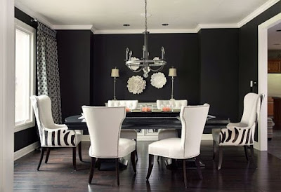
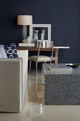
This is in direct opposition to the white/light look for walls and furniture.  But drama can be embraced.  It’s not for me at all, but it is a look that appeals to many people.  Navy walls are particularly fashionable as are black and rich greens.  
 navy walls dramatic rooms
dramatic rooms gold texture black walls
source 
black walls white dining room dramatic rooms
source
These are trends from 2013 -2015 that are still going strong:
  • geometric patterning 
  • nature inspired motifs especially florals 
  • reclaimed/eco-friendly material
  • wire framed furniture and lighting 
  • use of mixed materials in furniture  ( marble and wood, metal and wood etc. ) 
  • global inclusiveness  ( products from different cultures)
  • highly patterned tile
  • artisan products ( hand made) 
  • nude pink and deeper blues.  
And there you have it.  Lots of things to consider and choose from or just go on your merry way doing what makes you happy in decor.  

The post 2016 Home decor trend checklist appeared first on Decor Pur.
 Are your selves like mine?  They start out beautifully arranged and over time bits and pieces of things end up store there, and soon you have a  messy jumble.  If you are someone who can relax in a space no matter what is going on in it, perhaps a jumble of objects  doesn’t bother you.  I’m not like that.  If my environment is in a mess that is how my head feels. 

Here are 5 great tips to  bring order to unruly  shelves.


Vary sizes of objects 


One of the simplest rules when arranging vignettes is to have a range of object sizes for variety.  Some should be small , some medium and at least one piece that is large. And remember to layer to create interest.  Put a tray at the back and then stack  books and a small object on top of them. If you layer artwork make sure it is actually visible.  There’s nothing more annoying than using art work in a display and then covering it up.

Use repetition
Hillgrove Project traditional living room
Tim Barber LTD Architecture & Interior Design
Bookcase Accessorizing eclectic living room 
 Rachel Freeman

Repetition, when used well, creates a strong design. Choose several elements to repeat throughout the bookcase/shelving. If you have one stack of books laid horizontally, repeat this arrangement in at least two other places.  Use small sculptures, boxes or vases and rest them on top of a pile of books or magazines.

Keep it neutral 
 shelf-style-overall.jpg
Style at Home

When you have a range of objects to store,  one of the best ways to keep things looking pulled together is to choose neutral colour schemes.  I love white objects for this purpose. You might also consider silver, brass, wood etc.   There’s a lot going on in the space above, but because everything is white or very pale, a cohesive look is achieved.

 This neutral scheme allows the homeowner to display stored items in an interesting way.  Also notice that the organization on each shelf is organized in two sets with both having equal visual weight.

This is as neutral as you can get in both theme and colour scheme.I love the repetition of bottles and books with variety achieved through shape.
Keep interesting elements at eye level
 
 The Glitter Guide

This is an easy one and it really makes a difference. When you walk into a room , you tend to see what is at eye level first.  Don’t forget about “seated” eye level  too.  Keep boring objects toward the bottom.  Also remember that if you have a line of books or really dark objects they will have a lot of visual weight and should rest at the bottom of the display.

Create relationships
 Living eclectic living room
 Garrison Hullinger Interior Design Inc.
 
Amber Interiors

Choose a common element when you arrange shelving.  It could be similar colours, shapes or content/theme. Choose objects that relate to one another in colour and/or
shape to create unity. Vary the size of objects and make sure they relate to each other in some
way. In the images above the common theme is containers interspersed
with art work.

The post Taming open shelves appeared first on Decor Pur.

  What’s your interior design aesthetic?
             “
“What’s that you ask?  Design aesthetic?
Should I have one ?  Perhaps I do! ” 

This is not a question I could have answered in my teenage years, but it was those early years that laid the foundation for what I would come to understand and appreciate about design in my adult life.

 I believe our  interior design aesthetic (aspects of interior environments we are attracted to) is developed from what we’ve been exposed to  through our life experiences:  the house we grew up in,  homes of friends, your home town, reading, travel, and various forms of  media, etc. 

 The road to my house just before my birth
My house age 8
 Is this a town that raises a design conscious gal? 
“Yep!” 

 How did that happen?

I was exposed to very functional decor growing up in a small town in Newfoundland in the the  50’s and 60’s, but there were always  handcrafted  items in our home and I was encouraged to participate in their creation. There always seemed to be lots of scraps of wool, fabric and thread around.  I  appreciated what an individual could create with very modest materials, and I  believed at an early age that I could create anything I wanted.  That’s a pretty powerful beginning.

The Singer sewing machine got lots of use in our home. It was a sound I did homework to, read to and even made it hum myself. 

What came off it was varied: curtains, quilts, bedspreads, and even mini skirts and tent dresses. Fabric remnants came from family members in New York.  That link assured I was current in textile designs! When not sewing I was busy with  crocheting , knitting , and hooking  rugs. All added warmth to our home.

At 13 I discovered the library in the next
community and my design world expanded. 

Good Housekeeping

 There were books
and magazines 
that took me well beyond the small town I grew up in.  I devoured them,
imagined, sketched, and rearranged our bedroom (with my sister’s help)
numerous times.  Mom took it all in stride. 

 Quite the design statement!  I had nothing to do with this decor, but I did make the dress! Not bad for a 15 year old.  At the time, I thought I would be a fashion designer, but good old Newfoundland practicality took over. 

TV programming
added to my understanding of what was in style. I jet setted around the world with The Man (Men) from Uncle without ever leaving my living room. 

 And got my first taste of that famous British style on the Avengers. 

What we now refer to as Mid Century Modern design was in its prime in my formative years.  For the youngun’ reading this think  Mad Men. 


source 
When I was 19 I spent the summer in New York. It was a trip of firsts.  First time I went to large department stores,  first time to see art galleries,  first play…..   And what about what I saw on the streets and in store windows?  It all went in and somehow came together into a feeling, a sense of what I liked and wanted in future interiors.While this type of decorating was happening in New York….

Albert Hadley, New York, 1971
The average homeowner was living in this.

That was a pivotal time in my understanding of the broader world and the vast discrepancies among the homes I was used to and the homes of the “out of reach”. I began to read more and think about what elements and principles interested me  in the designed interiors I was viewing on TV and reading about. My design aesthetic was forming.  

In 1973 I got my first apartment and  it had a lively colour scheme of white with red and navy accents.  All very fresh and simple.   All second hand and dressed up with lots of covers and paint.   I moved from being a university student to a teacher – a different kind of designing! I continued to read about design and do lots of DIY projects. 

It wasn’t until the mid 80’s that I decided to study interior decorating and it would be another twenty years before I officially advertized as a decorator.  I would contend I was always one. During that time I also began to paint.  It was this activity that honed my colour sense and gave me a firm understanding of the elements and principles of design. 

 My design interests today can be traced back  to my roots as a mid century modern girl.  I still love clean design without too much “fussy”.  I like  furniture with straight lines,  geometric motifs especially circles, lots of texture, light colours, hand made items and abstract art.  I describe my look  as casual contemporary with a quiet edge.

What’s your design aesthetic?


The post The making of an interior decorator appeared first on Decor Pur.