Hopefully you are into blue! Blue seems to be a dominant colour in Pantone’s colour forceasting for both spring 2013 and upcoming 2014. Here’s how it’s playing out….


Two blues, but with great differences. I can’t say blue is a big favourite of mine, but I am really into Monaco blue because it is a warmer blue that is approaching navy. I don’t think it is a blue that you would catagorize as trendy. Perhaps timeless would be a better descriptor. Dazzling Blue seems to be a colour that will not be around for the long haul. It is cold, quite exciting ,and lends itself well to accessorizing. It isn’t exactly a colour you snooze to. Could you have it on a wall? Not me, but there are those who would.
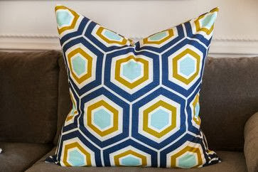
You could use it a little or go whole hog and saturate your space with it.


I really like it mixed with various grays and all that texture. Both serve to tame it down a little. You will notice quite a bit of colour variation in the blues above. Mixing a more vibrant dazzling blue in with “tamer” blues seems to be a good solution if you aren’t into bright.


The post Are you feeling blue? appeared first on Decor Pur.


0 comments:
Post a Comment